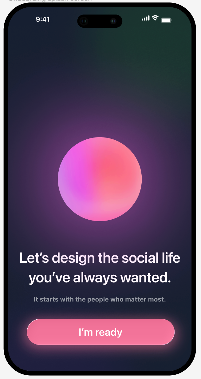
The core challenge was not just usability, but clarity and trust.
Users did not immediately understand how the product differed from existing tools like group chat or calendars. At the same time, introducing AI too early risked overwhelming users before they had context or confidence.
Behavioral insights added another layer of complexity. They needed to encourage growth and reflection without making users feel labeled or boxed in. Social relationships are fluid, and the product needed to reflect that without requiring heavy upfront setup.
The work began with defining how users should feel when interacting with the product, not just what they should do.
I led early ideation and UX direction, exploring how AI could be introduced gradually through familiar interaction patterns. Instead of presenting the system as an all-knowing assistant, the experience framed AI as something that evolves alongside the user.

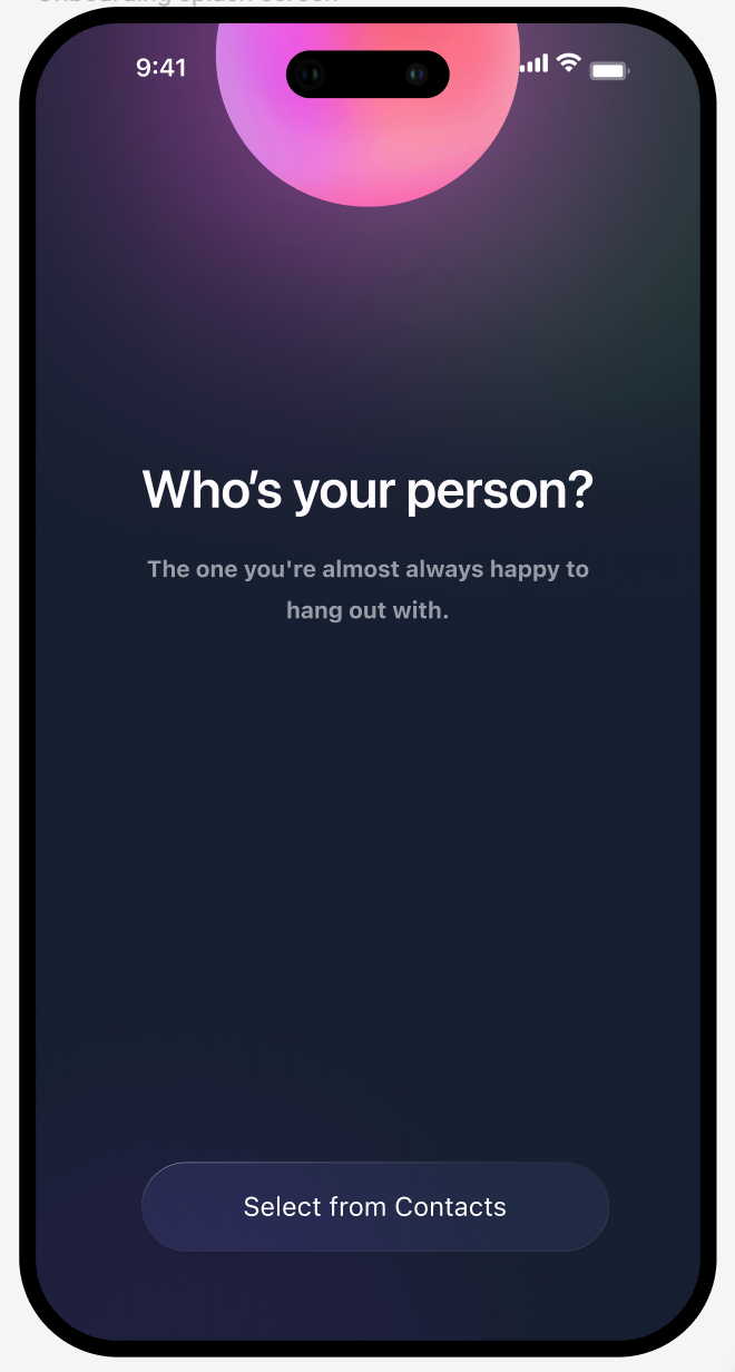
Early onboarding focused on lightweight inputs and tone. The goal was to create immediate engagement without requiring users to fully configure their social world.
As the product evolved, the focus shifted to how insights could be surfaced meaningfully. Instead of presenting static traits, the system highlights patterns over time, helping users understand how they engage socially and how that behavior changes.
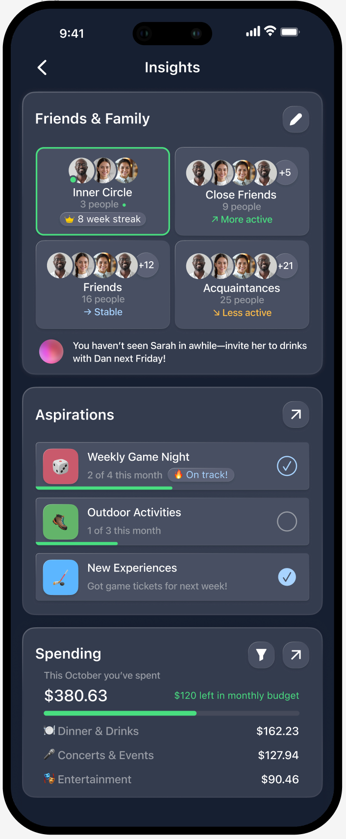
To support real-world decision making, the experience connects insights directly to action. Planning suggestions are informed by behavior, preferences, and social context.


Several principles guided the design:
Clarity over novelty
The product needed to feel understandable before it felt intelligent. Familiar patterns were used to ground new concepts.
Progress over identity
Insights were framed as direction and momentum, not fixed labels. This avoids boxing users into static definitions.
Low-friction social modeling
Instead of requiring users to define their social circles upfront, the system builds understanding over time through interaction.
Tone and emotional safety
Language, hierarchy, and empty states were designed to keep AI feedback supportive and non-judgmental.
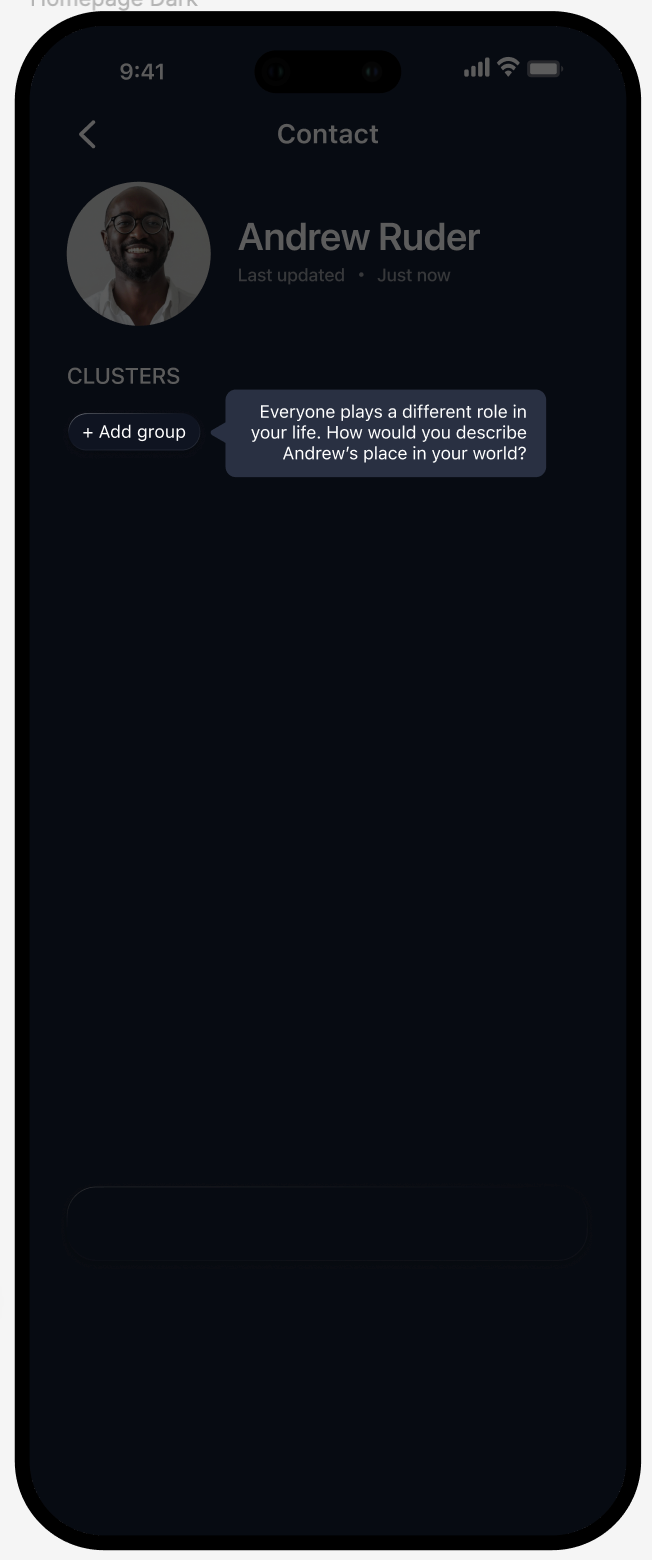
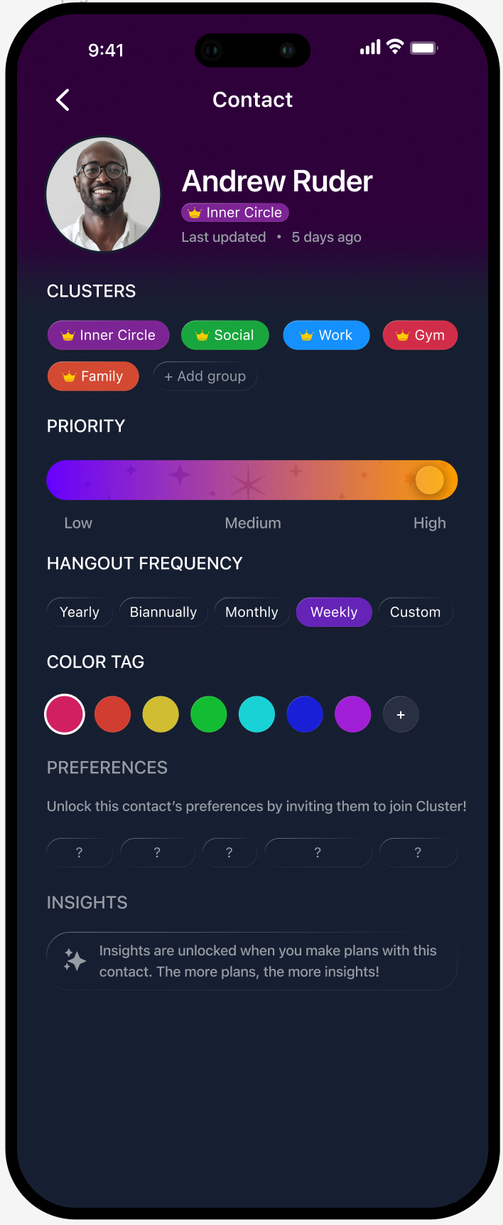
Beyond individual screens, the work focused on how the system behaves across time.
User journeys were mapped to understand how onboarding, insights, and planning interact as a continuous loop.

Multiple structural approaches were explored to determine how insights, profile, and settings should coexist without overwhelming users.


The result is a cohesive mobile UX foundation that balances clarity, intelligence, and emotional tone.
The system introduces AI in a way that feels integrated rather than imposed, supporting users in understanding their social behavior and making better decisions over time.
The project is ongoing and pre-launch, with designs prepared for development and future iteration.
Take a look at my resume!