Working within a small startup team, I owned the visual direction end-to-end, building on early wireframes and collaborating directly with the product lead as the concept evolved.
The early direction for the product centered around Eat Your Match, positioning the app as something social and relationship-driven. This framing shaped the initial visual language, which focused on themes of connection, pairing, and shared experience.
As that direction took form, I translated it into the product experience itself.
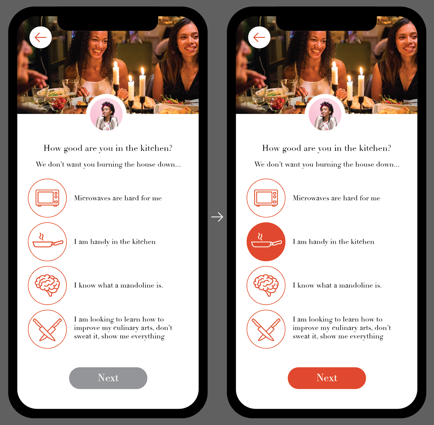
I defined the visual language across the interface, including color usage, iconography, imagery, and interaction states. This screen reflects how the identity translated into product decisions: warm, saturated tones to guide interaction, simple icon systems for clarity, and clear active states to reinforce user input.
While another team member focused on wireframing structure, I was responsible for how the product looked and felt, refining visual hierarchy, defining interaction states, and maintaining consistency between brand and interface.
From there, the work expanded into extensive logo exploration as the product lead continued refining the brand direction. Each round responded to evolving expectations, moving from relationship-driven concepts into more literal, then more abstract interpretations of food and dining.
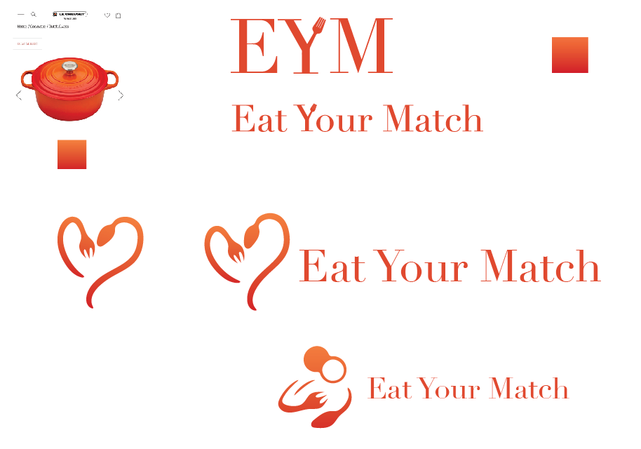
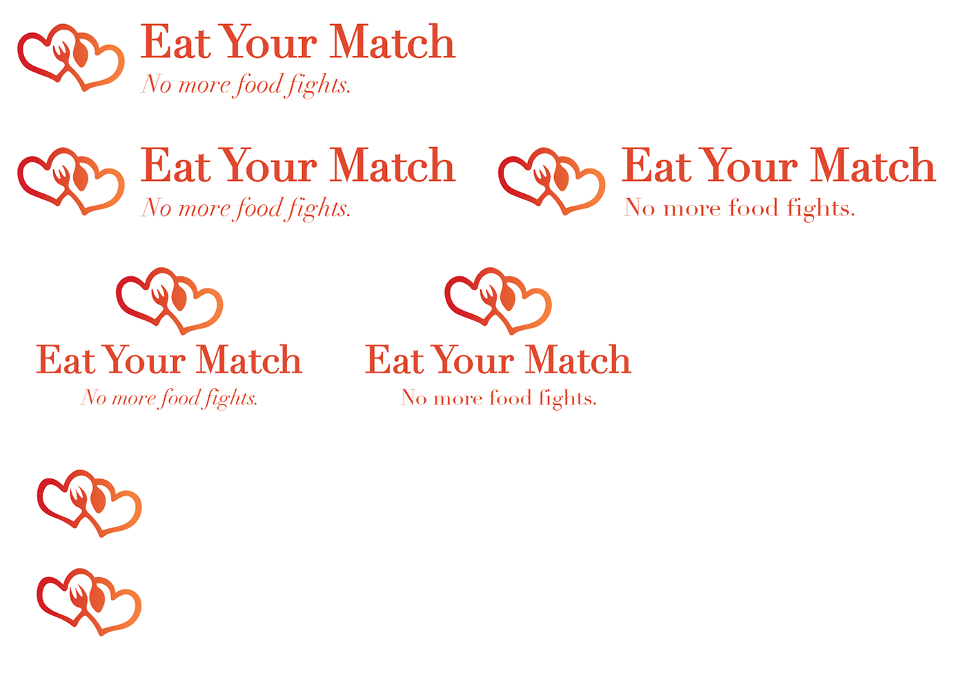
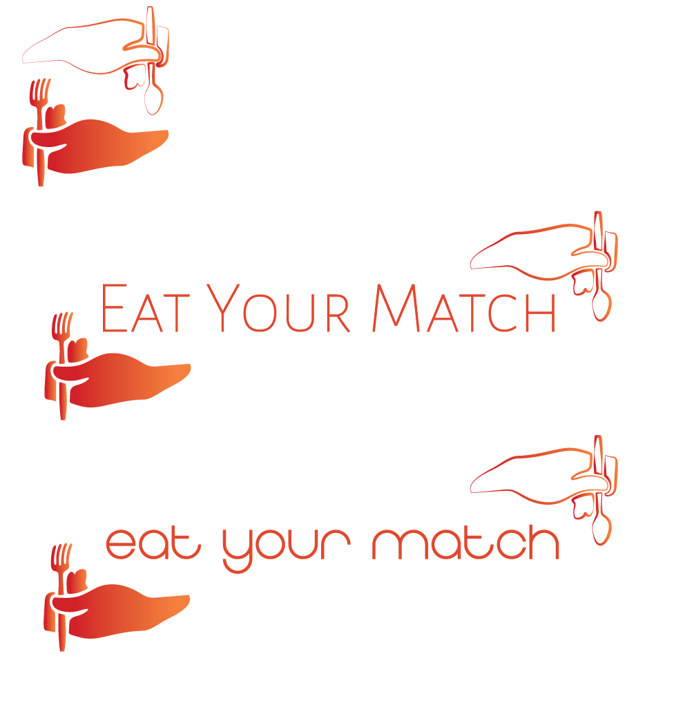
I explored a range of concepts that leaned into this idea—using heart shapes, paired elements, and soft, rounded forms to suggest compatibility and shared experience. These directions aimed to make the product feel warm and social, rather than purely functional.
As the exploration continued, the focus shifted slightly toward grounding the concept more directly in food and dining.
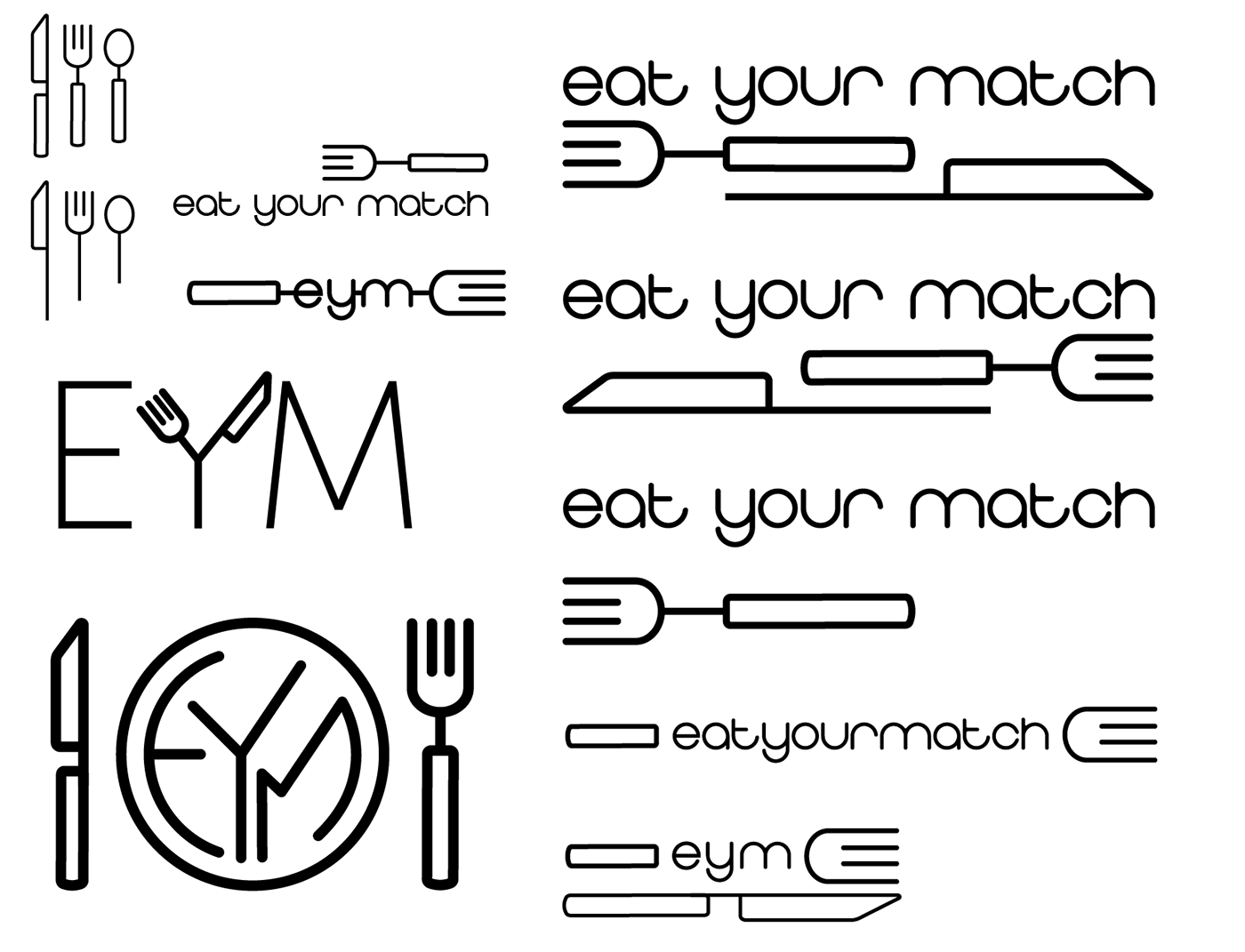
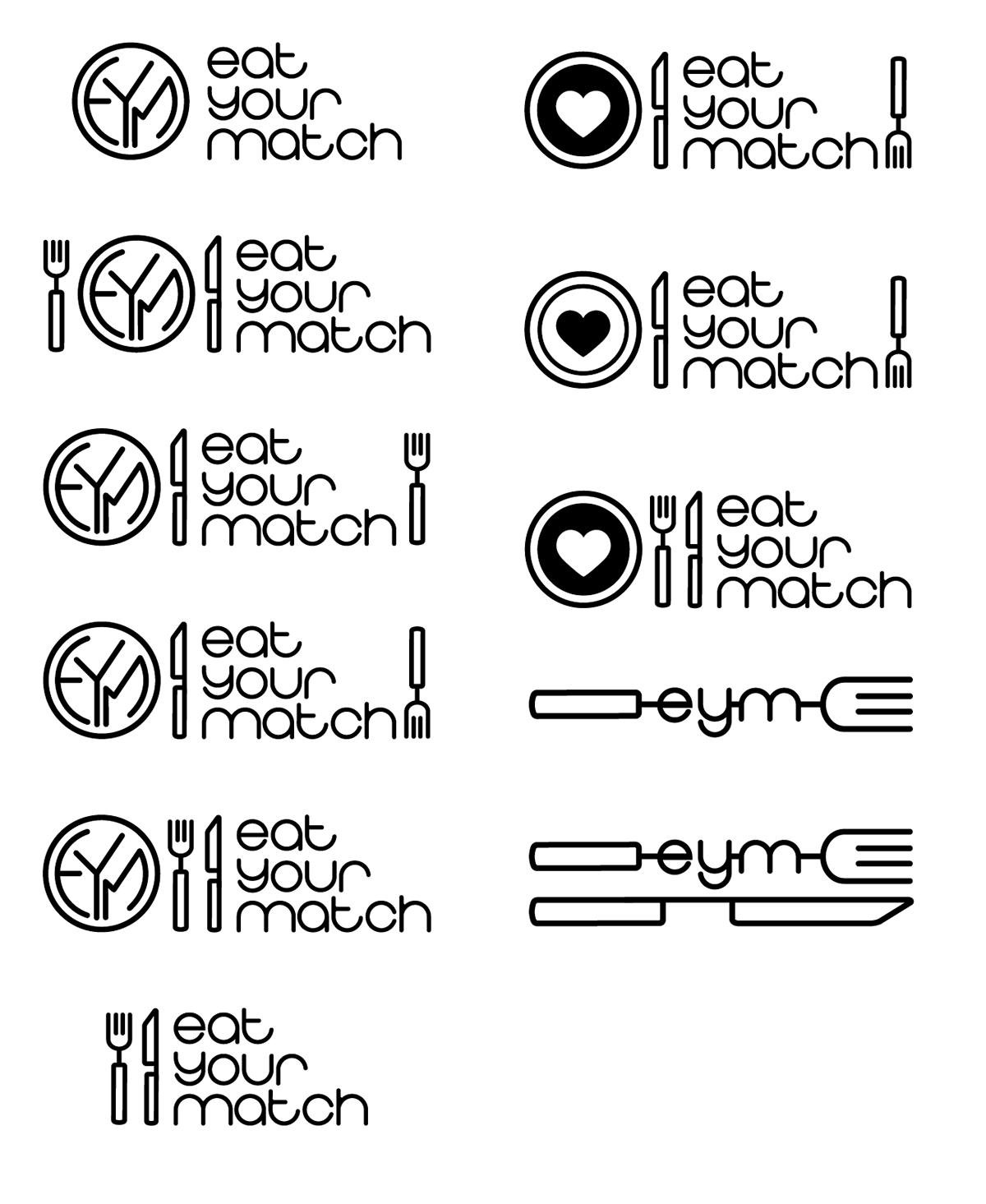
This phase moved toward more recognizable dinnertime visuals—plates, forks, and utensils—testing how clearly the concept could be communicated through familiar symbols. The goal here was to create something more immediately legible while still maintaining a distinct identity.
From there, I was asked to explore directions that felt less literal and more expressive.
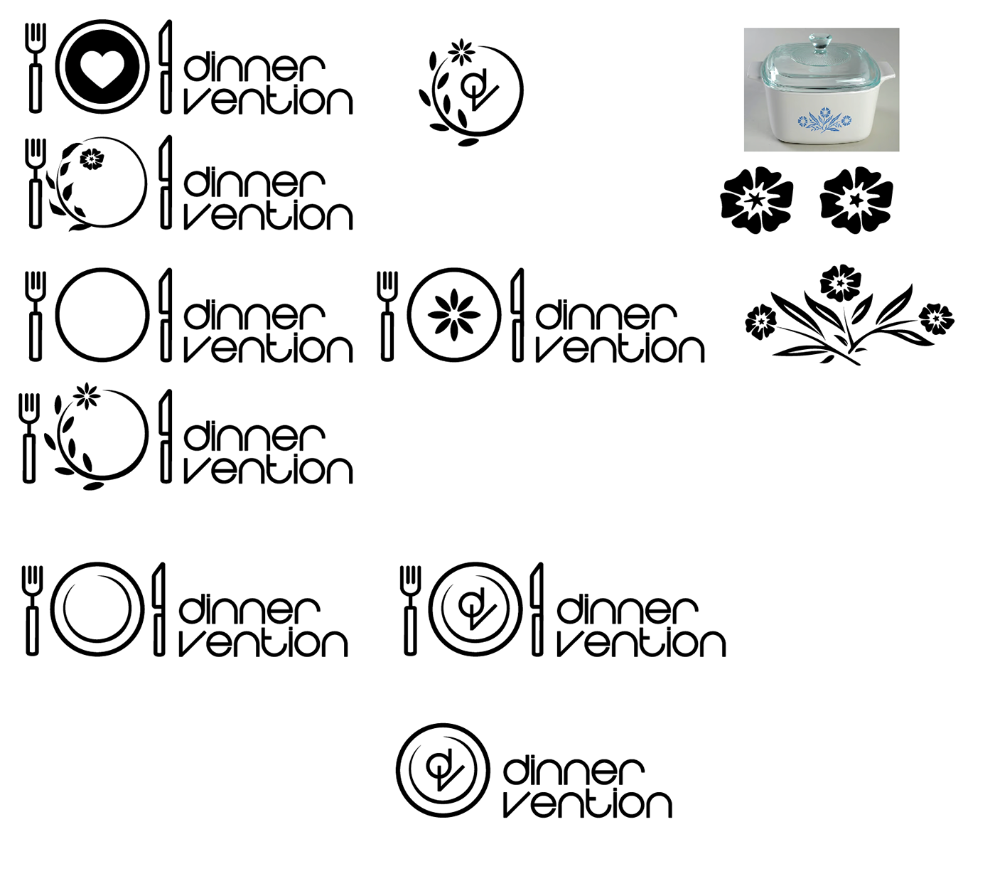
These concepts leaned into a softer, more atmospheric tone—drawing inspiration from home dining, comfort, and nostalgia. The intention was to see whether a less direct approach could better capture the feeling of the product, rather than the mechanics of it.
At this point, the visual direction was still open, and the work became a way to compare very different interpretations of the same idea.
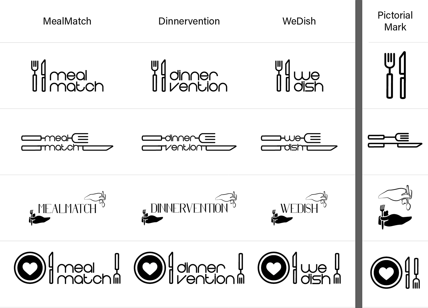
Toward the end of the project, feedback surfaced that Eat Your Match was being interpreted in unintended ways. This led to a broader conversation around naming, and the visual identity work shifted to support that exploration.
Rather than refining a single direction further, I adapted the existing concepts to work across multiple naming options—helping the team evaluate how each name changed the tone, clarity, and overall perception of the product.
The final direction moved toward DinnerVention, but the project concluded shortly after the transition. Throughout the process, my role remained focused on guiding the visual identity through a constantly evolving concept—using exploration not just to produce options, but to help the team better understand what the product could be.
This project strengthened my ability to lead visual design in ambiguous environments, respond to shifting direction, and use design as a tool for alignment and decision-making.
Take a look at my resume!