I’ve played hockey since I was a kid, and I still play today in all the beer leagues I can get my grubby little gloves on. I know how much a team identity matters, especially in rec hockey, where names, jerseys, mascots, and inside jokes become part of the fun (my team right now has fan favorites like Four 20, Blink One 82, and the usual Shoresy 69 reference).
That is the kind of hockey culture this collection is built around. It includes logos, jersey graphics, and team identity work for recreational teams, charity projects, and hockey-adjacent brands. Some projects start from scratch. Others build on an existing team mark, whether that means updating a mascot, creating an anniversary graphic, adding custom illustration, or making the logo work better on a jersey.
Whether the idea starts as a serious rebrand, a team joke, or a rough concept that needs a visual direction, I can help turn it into a logo your team wants on the jersey, the group chat, and everything in between.
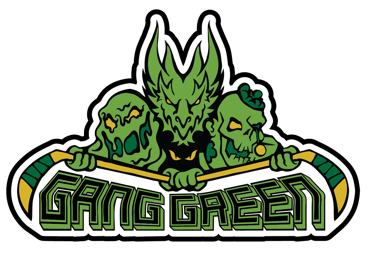
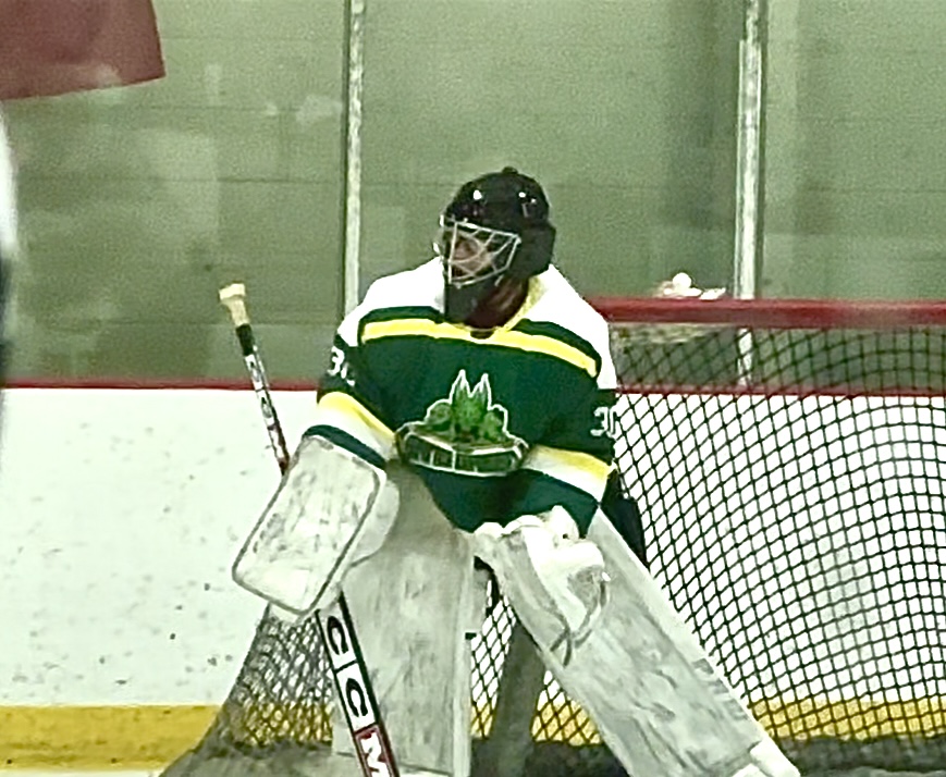
Gang Green was designed as a bold, illustrated hockey identity built around a multi-character composition. The logo translates the team name into a unified group of creatures, including a slime figure, dragon, zombie, and hidden glowing-eyed character.
The design balances detail with readability, using a limited green and yellow palette, heavy outlines, and a strong overall silhouette. Even with multiple characters, the mark holds together as one recognizable shape for jerseys, digital use, and on-ice visibility.
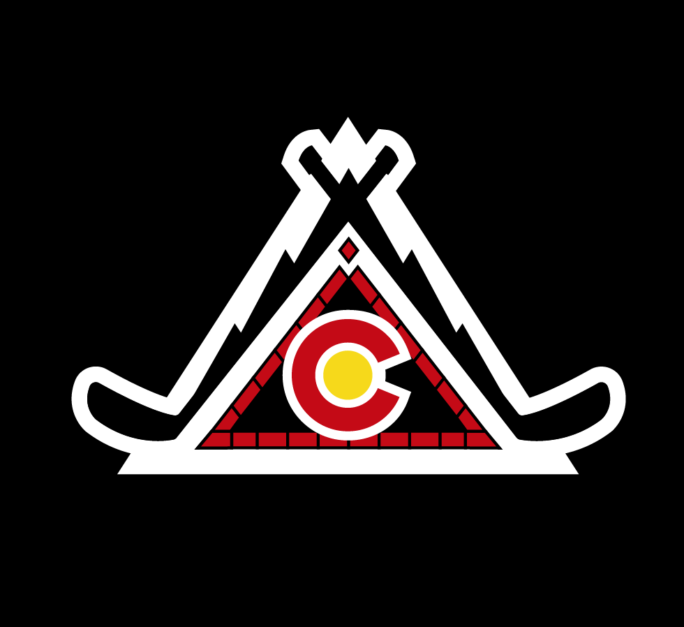
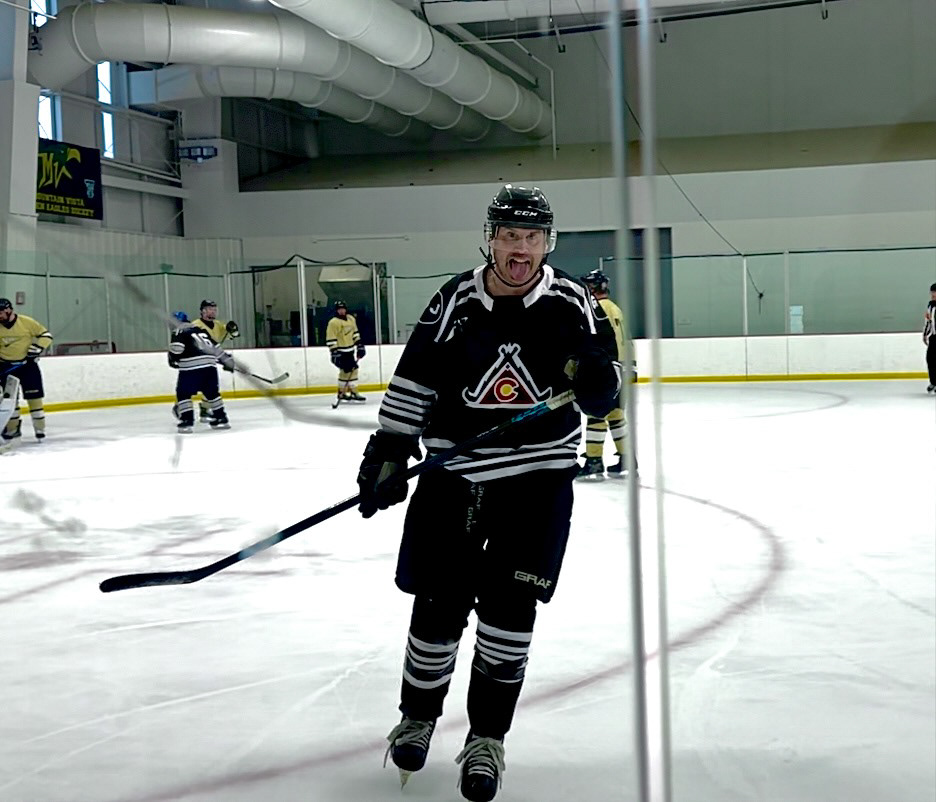
The Redbricks anniversary jersey was a team-led redesign built from their existing Colorado-inspired brick logo. The original mark already used the red brick “C,” mountain silhouette, and yellow center circle, so the anniversary version focused on adapting that identity into a cleaner, more structured jersey graphic.
The final design uses crossed hockey sticks, a triangular mountain form, and the team’s existing red, yellow, blue, and black palette. The result keeps the spirit of the original Redbricks identity while making it feel more balanced, symmetrical, and jersey-ready.

Hockey Heals was a customization of the existing DAWG Nation logo for a program supporting injured and disabled hockey players. Since the original concept was already recognizable, my work focused on adding details that made the mark feel more specific to Hockey Heals.
I added the eyepatch, scar and stitch details, bitten ear, and broken stick pieces flying out of the bite. These updates reinforced the themes of injury, recovery, and toughness while preserving the existing DAWG Nation identity.

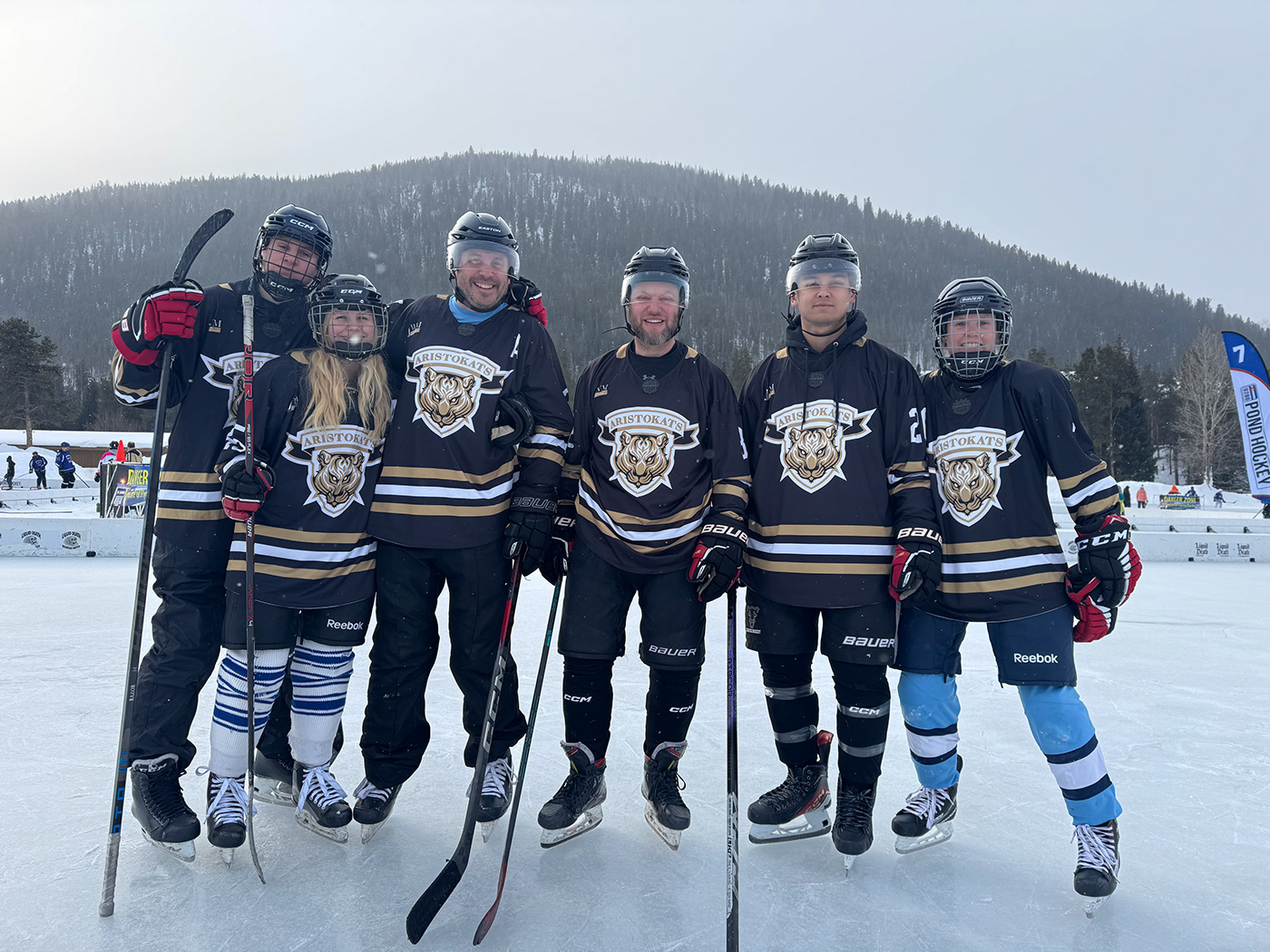
The Aristokats jersey concept uses a polished tiger crest, gold striping, and a formal sponsor-style layout to create a more refined hockey identity. The design leans into the team name’s upscale tone while still keeping the mark aggressive enough for a sports jersey.
This project focused on translating a character-driven logo into a full uniform concept. The white and gold palette gives the jersey a clean, elevated look, while the central crest provides a strong visual anchor.
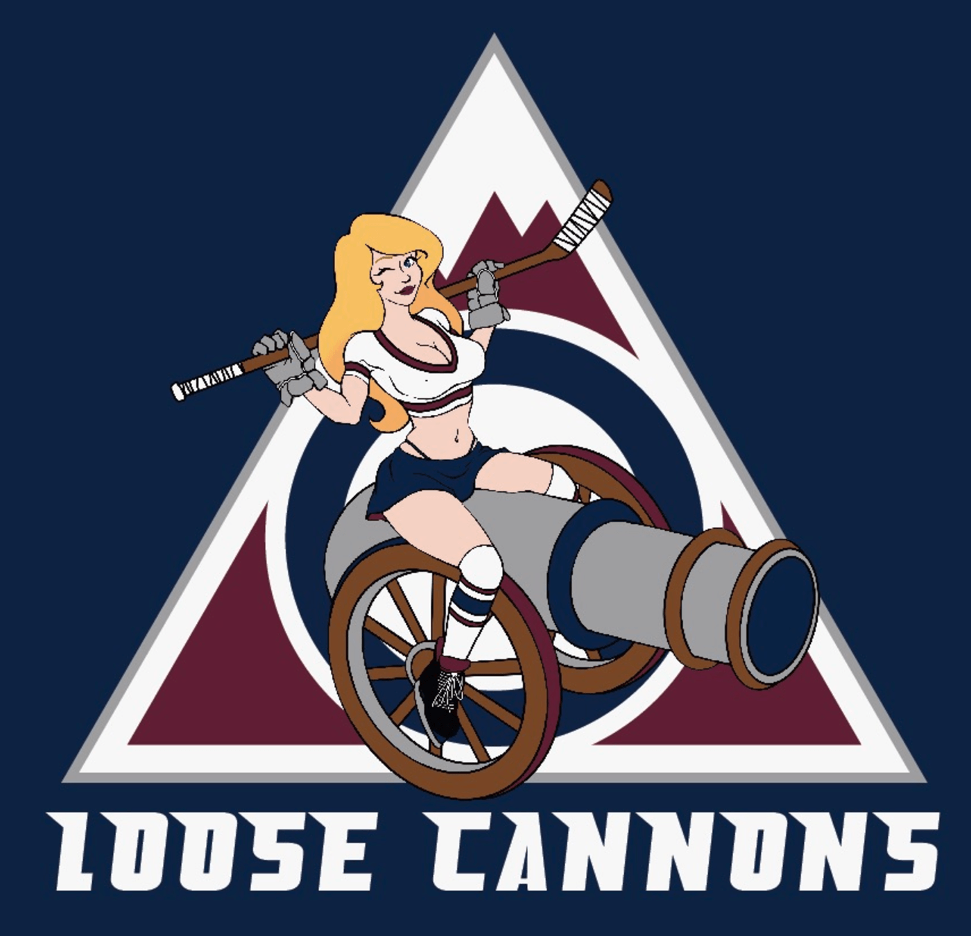
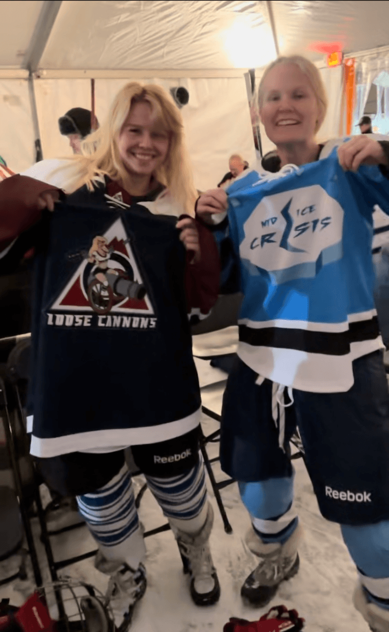
Loose Cannons is a playful, character-driven hockey logo built around a cannon mascot concept. The design uses a vintage Colorado-style backdrop with a bold illustrated figure to create a team identity that feels chaotic, fun, and full of personality.
The mark combines humor with sports-logo structure. The cannon, hockey stick, and strong type treatment help the design stay connected to the game while giving the team a distinct and memorable personality.
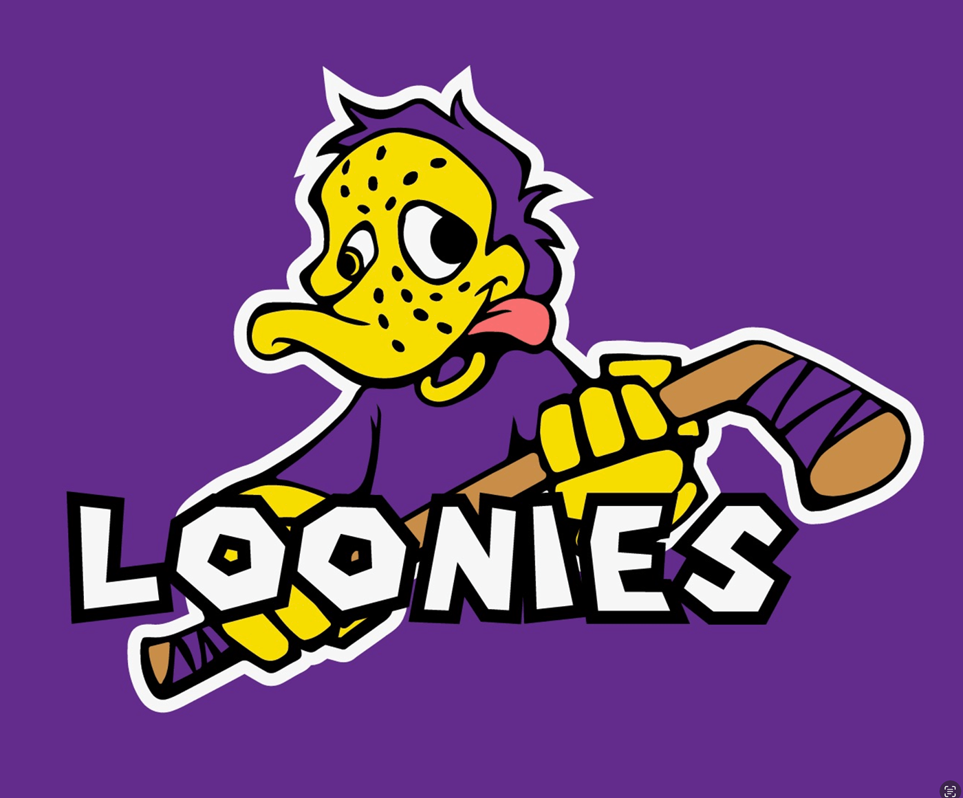
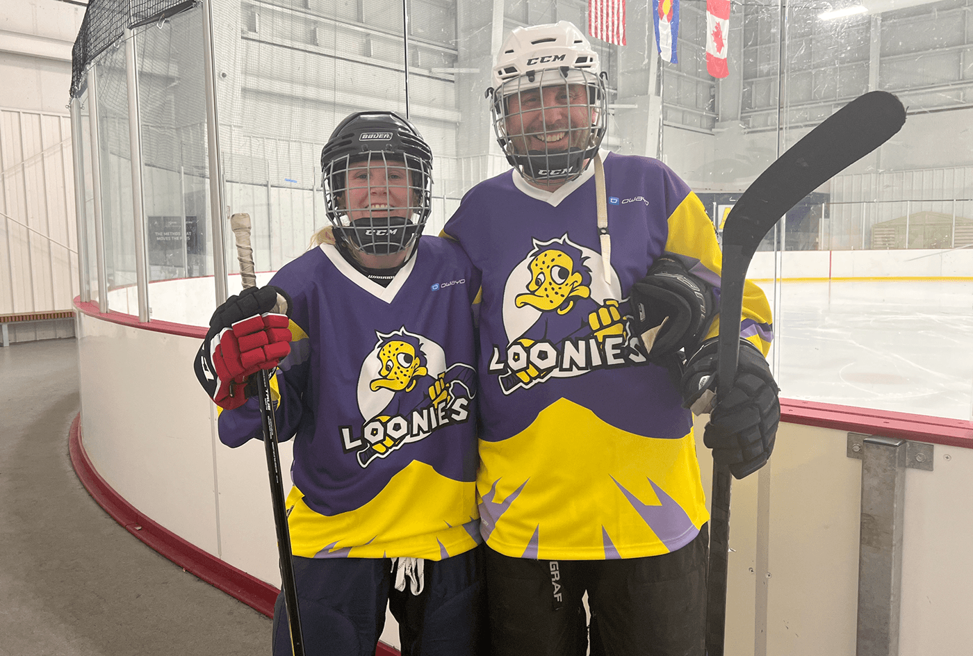
Loonies was designed as a bright, playful hockey logo with a cartoon loon mascot and bold team lettering. The purple and yellow palette gives the mark strong contrast, while the character expression makes the identity feel energetic and approachable.
The design is intentionally more fun than intimidating. It works well for a recreational team identity because it feels personal, easy to recognize, and built around a mascot players can actually connect with.

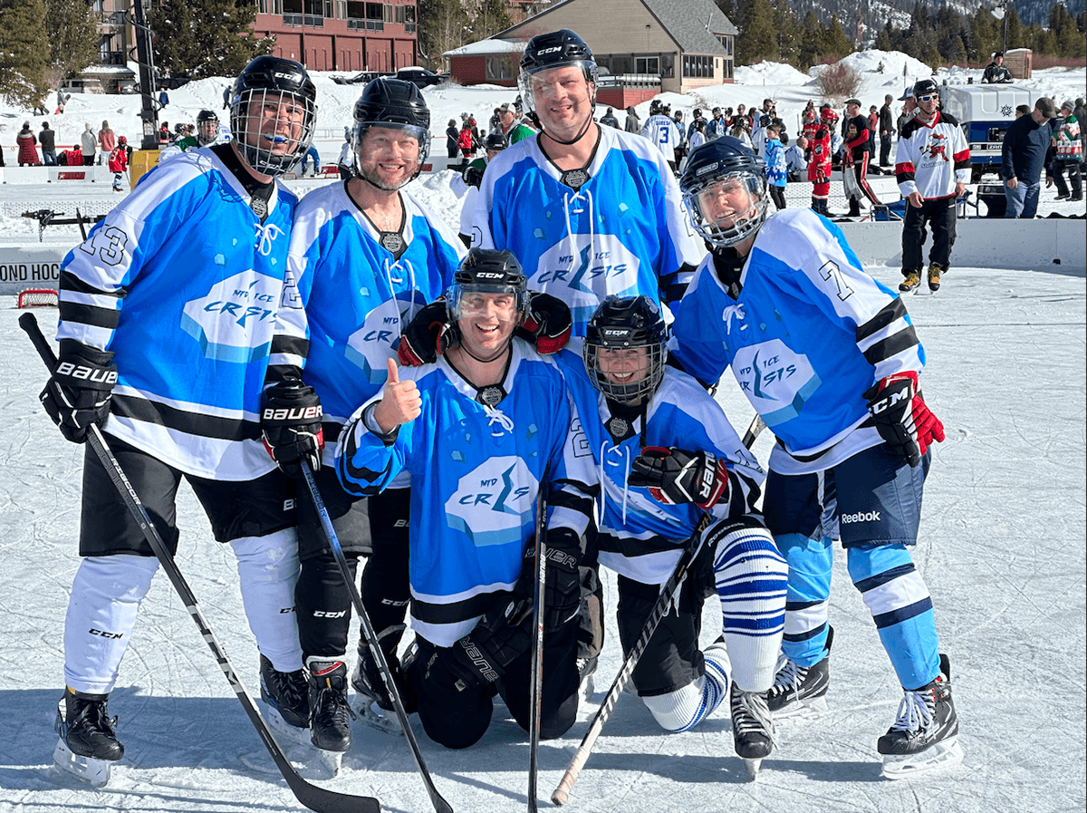
Mid Ice Crisis uses a cracked ice concept to turn the team name into a visual joke. The design explores both light and dark colorways, showing how the same mark can shift tone while maintaining the same structure and concept.
The broken ice shape, scattered fragments, and split lettering create a simple but memorable team identity. It is less mascot-focused than some of the other designs, which gives the collection more variety and shows a different approach to hockey branding.
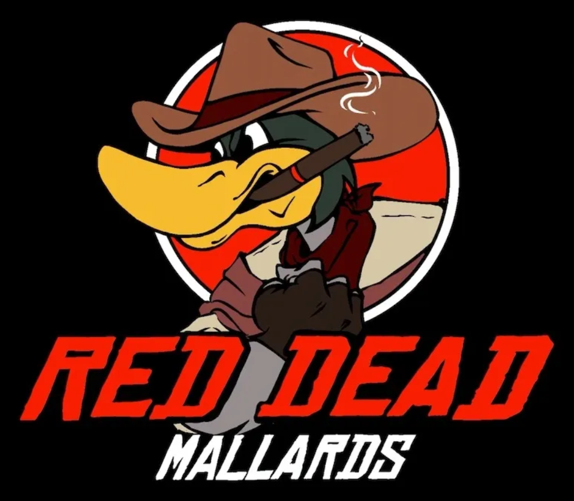
Red Dead Mallards was an existing duck logo that I adapted into a western-themed hockey identity. The base mascot was already there, so my work focused on transforming the character into a cowboy through the hat, cigar, outfit, and western styling.
The update gives the team a clearer theme and stronger personality while preserving the recognizable duck character. The result feels funny, bold, and specific to the team name without needing a full logo rebuild.
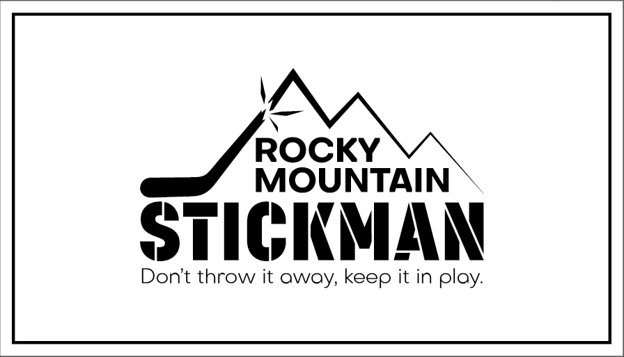
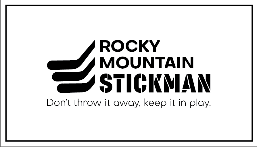
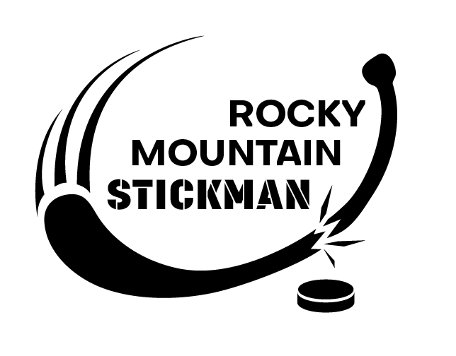
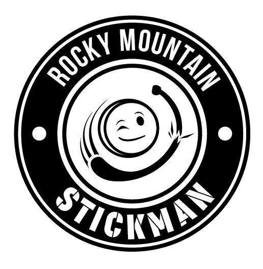
Rocky Mountain Stickman is a hockey-adjacent brand identity for a stick repair business. The logo exploration included several directions, from clean mountain-and-stick marks to more playful puck and broken-stick concepts.
Including these concepts shows the broader range of hockey-related design work beyond team logos. The project focused on creating a mark that communicates repair, reuse, and hockey culture in a simple, flexible way. See my Rocky Mountain Stickman case study for a more in-depth overview.
Need something for your own team? I can help with logos, jersey graphics, mascot updates, merch, social graphics, websites, and any other design work you have in mind. My usual rate is $50/hour, but every project is different. Reach out and we can figure out what makes the most sense for you!
Take a look at my resume!