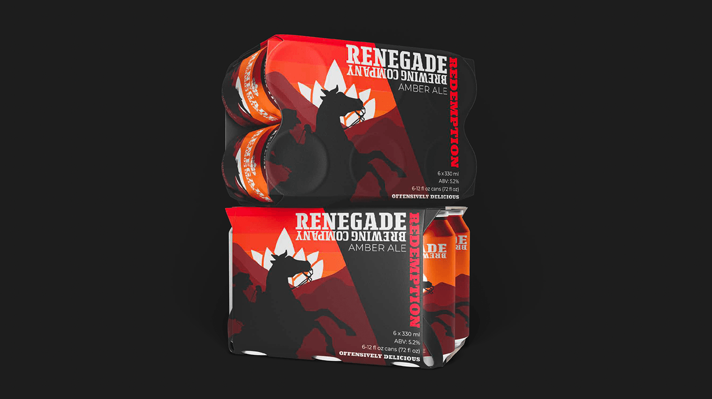
This project focused on rebranding an established craft brewery and creating a visual system that could extend across packaging, events, and brand storytelling. Working as part of a small team, we developed a clearer brand direction rooted in individuality, craft, and creative expression.
My contributions centered on defining the brand framework early in the process and carrying that direction through to the final art series, which became the most expressive and visible part of the system.
The rebrand began by identifying how Renegade could better connect with a wider audience, particularly through events and local engagement. The goal was not just to refresh visuals, but to clarify what the brand stood for and how it should show up across touchpoints.
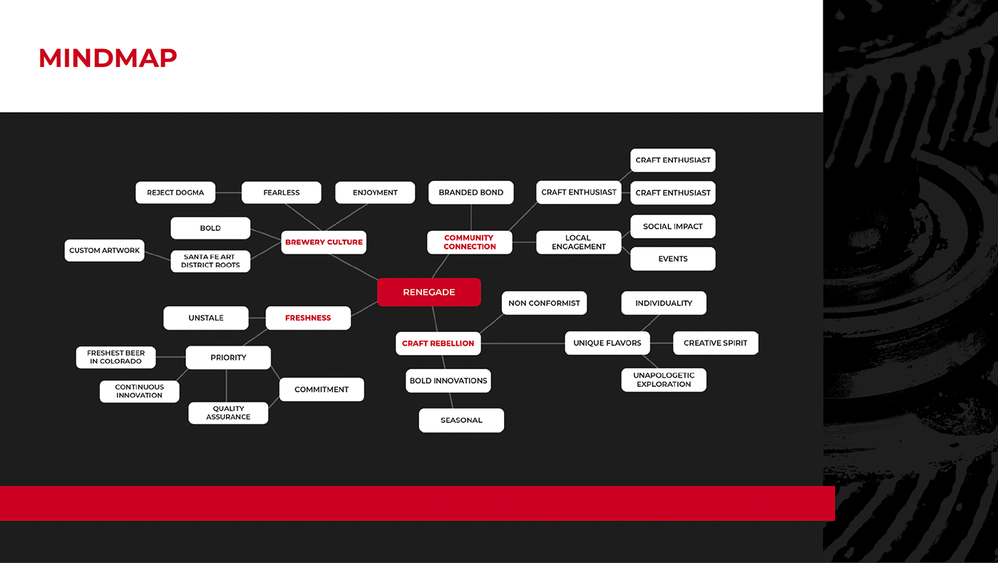
I developed the mindmap to help translate abstract ideas into a shared direction. This exercise connected concepts like craft rebellion, local engagement, and creative spirit, forming a foundation for later visual and messaging decisions.
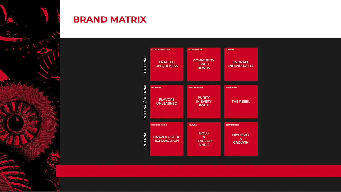
Building on the mindmap, I created a brand matrix to structure the identity more formally. This clarified how the brand should express itself externally while staying grounded in internal values, giving the team a consistent reference point as we moved into execution.
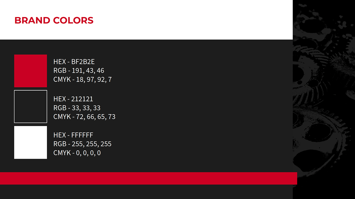
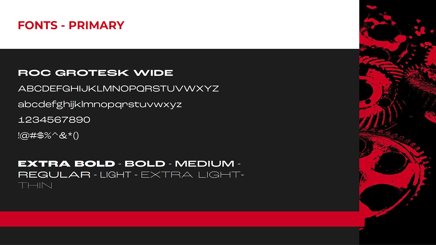
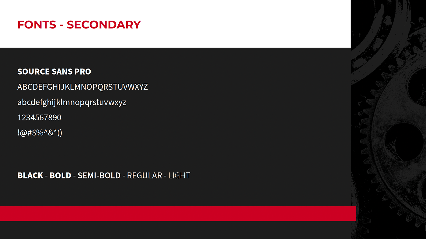
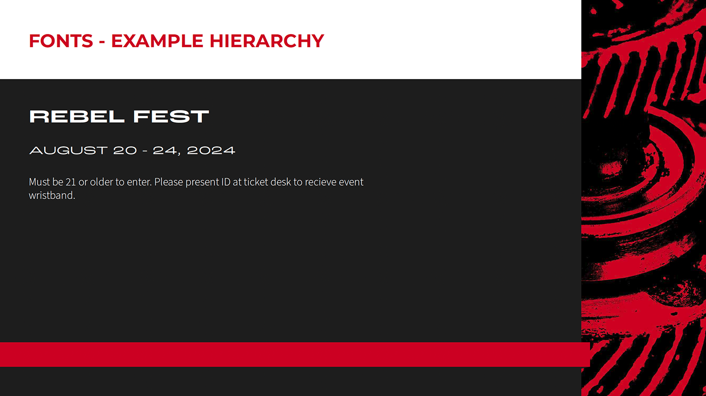
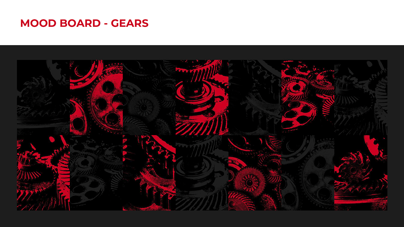
As a team, we developed a visual system built around strong contrast, bold typography, and a limited color palette. The direction was intentionally striking to reflect the brand’s nonconformist positioning and to stand out in a crowded craft beer market.
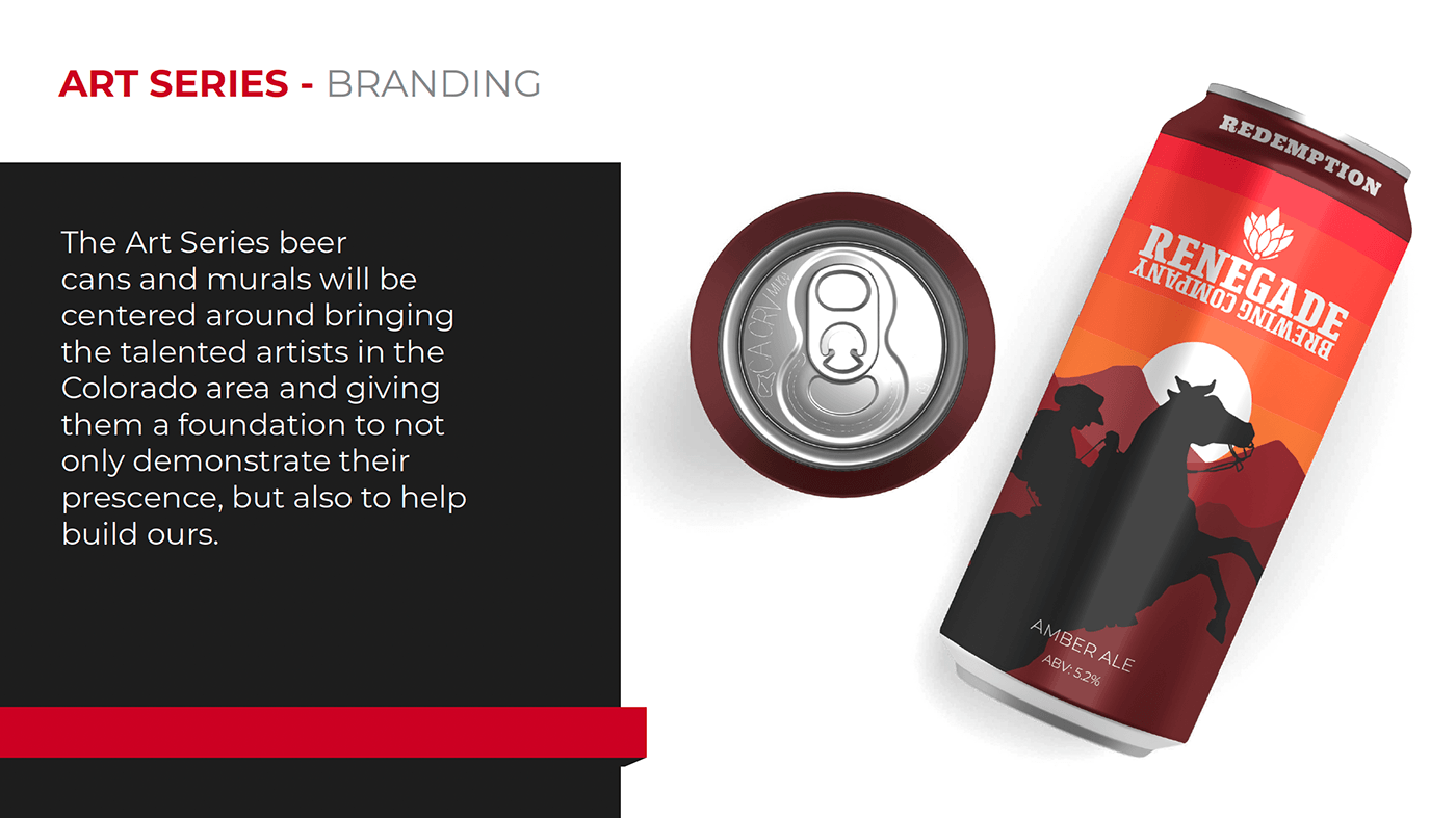
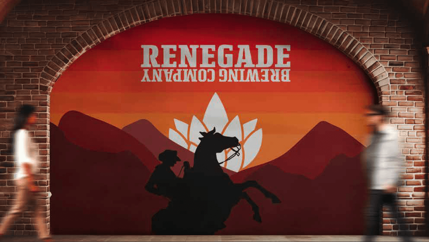
My primary contribution came in the final phase, where I developed an original illustration style to anchor the brand visually. The goal was to create artwork that felt distinctive and expressive while remaining bold and legible at shelf distance.
The series uses strong silhouettes, layered landscapes, and high-contrast color to create a recognizable visual language. This system was designed to scale seamlessly across touchpoints, from individual cans and multi-pack packaging to large-scale murals and environmental applications.
Applied to packaging, the artwork creates a cohesive shelf presence while allowing flexibility across different products. In larger formats, the same visual language extends into physical spaces, reinforcing the brand in a more immersive and public-facing way.
IMPACT
This project resulted in a cohesive rebrand that connects strategy, identity, and execution. My contributions helped define the brand’s foundation and brought it to life through a distinctive art series that carries across packaging, events, and environmental applications.
The outcome is a flexible system that strengthens brand recognition while allowing for continued expansion across future products and experiences.
Take a look at my resume!