Visit the Figma file here.
A mobile-first redesign of Denver’s RTD transit experience, focused on simplifying everyday rider tasks through a unified system. The concept consolidates trip planning, ticketing, and service alerts into a single, consistent interface designed for real-world use on the go.
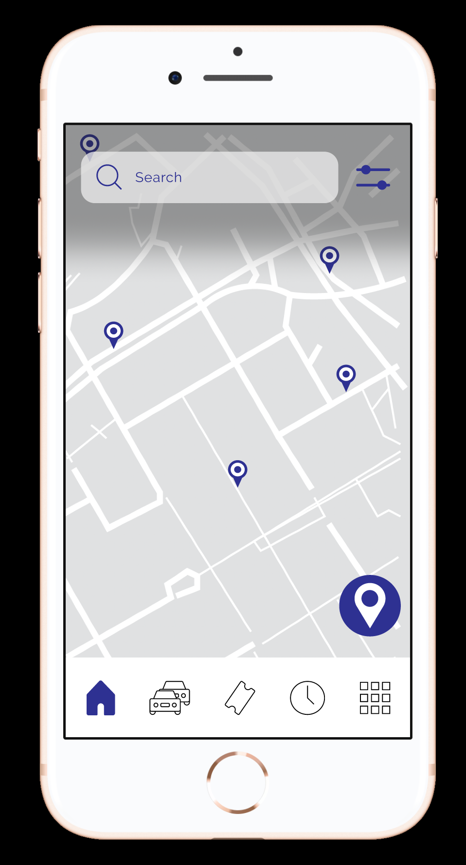
Denver Metro’s RTD experience was fragmented across multiple apps and flows, forcing riders to navigate inconsistent patterns for core tasks. Trip planning, ticketing, and service alerts operated as separate systems, increasing cognitive load and slowing down time-sensitive actions. This created particular friction for riders relying on quick access to information, including commuters and users with accessibility needs.
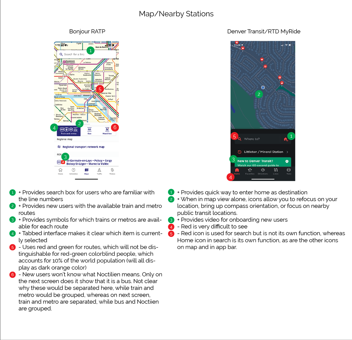
Grounded in four years of daily rider experience, this project was informed by direct observation and conversations with a range of users, including students, commuters, and riders with accessibility concerns. The evaluation focused on findability of critical actions, accessibility of information and controls, and efficiency of completing core tasks.
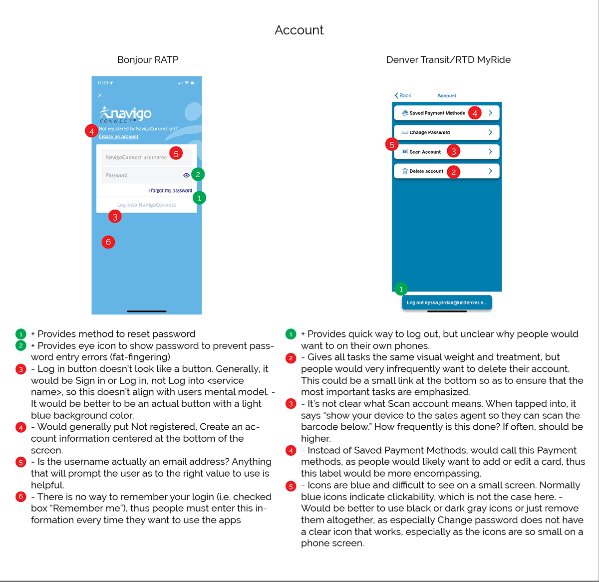
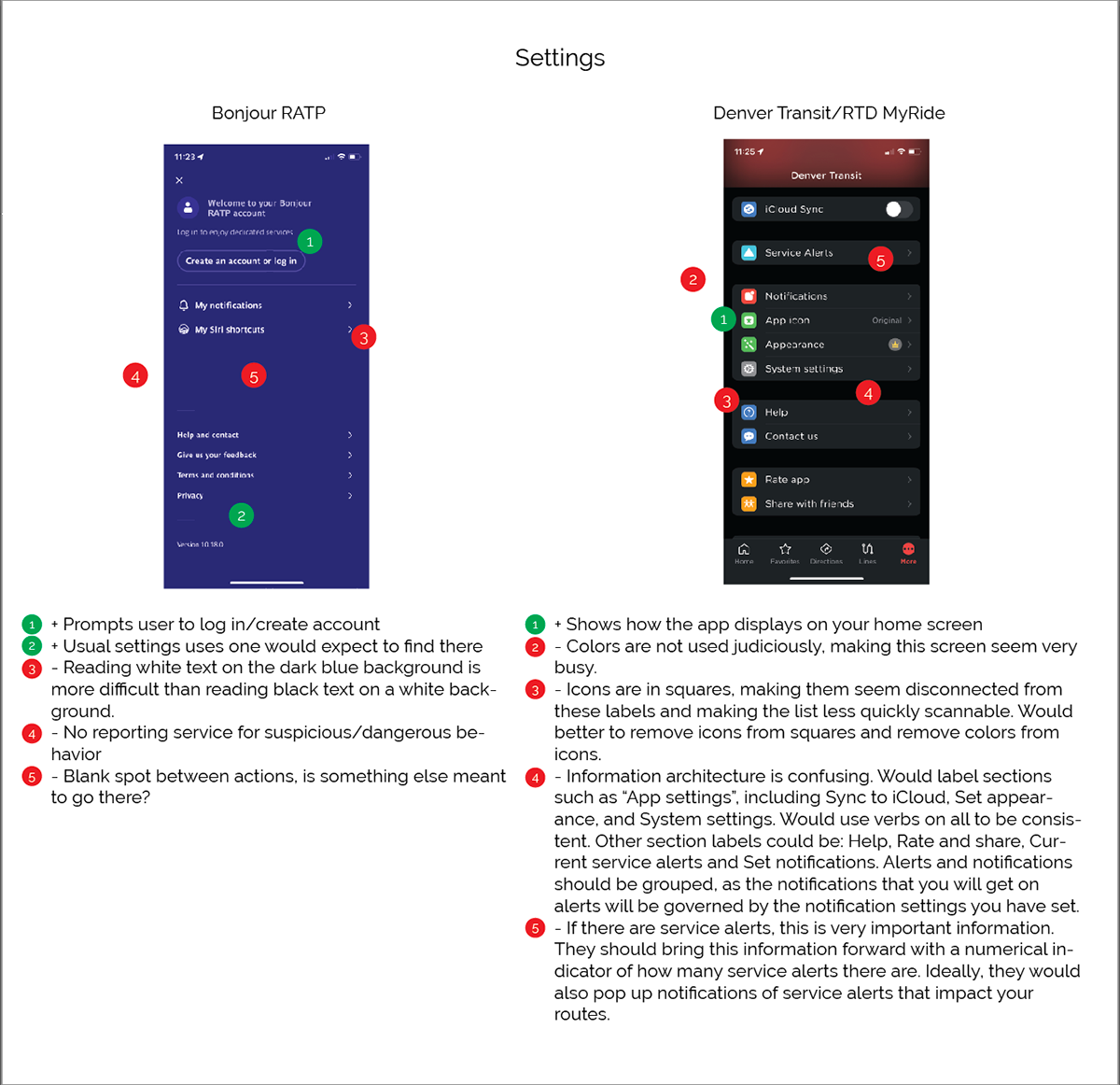
I audited the existing RTD apps alongside other transit platforms to identify breakdowns in navigation, hierarchy, and interaction patterns, then mapped core flows to reduce unnecessary steps and decision points.
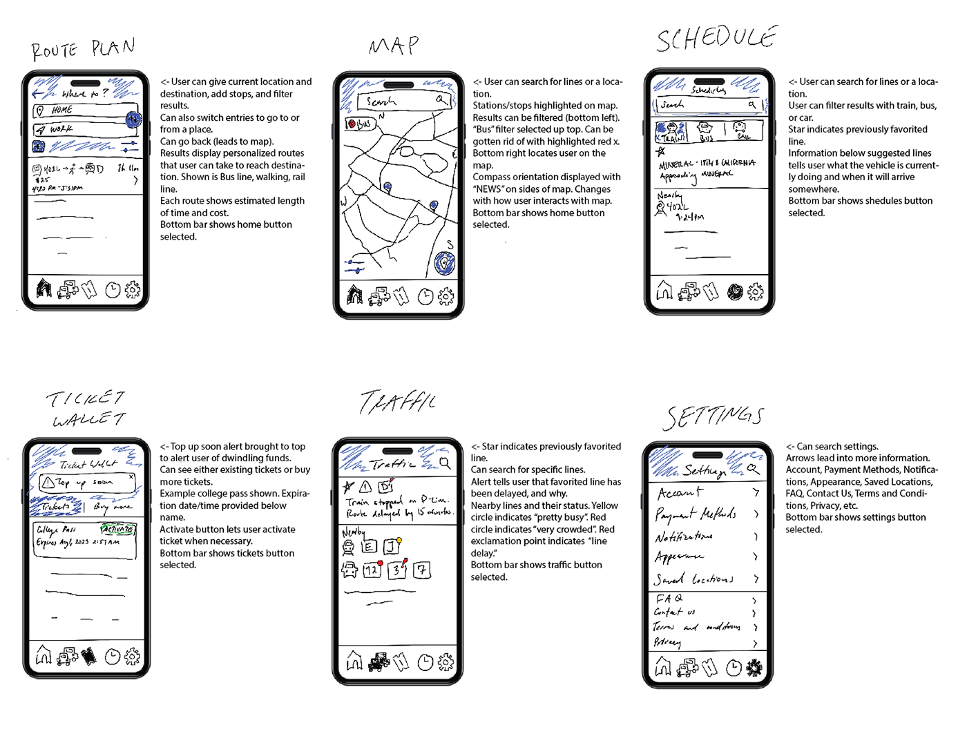
From there, I redesigned the experience into a unified, mobile-first system with consistent interaction patterns across all features.
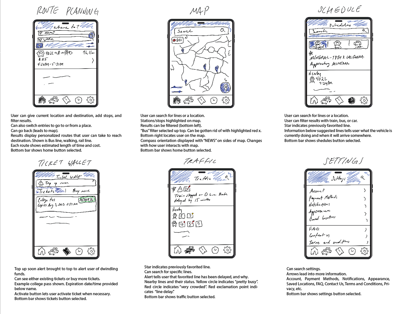
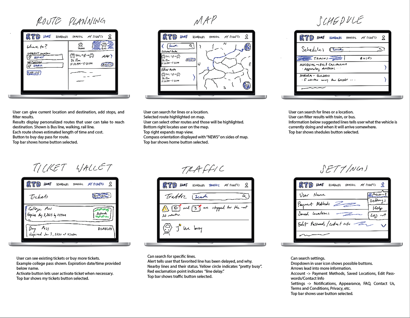
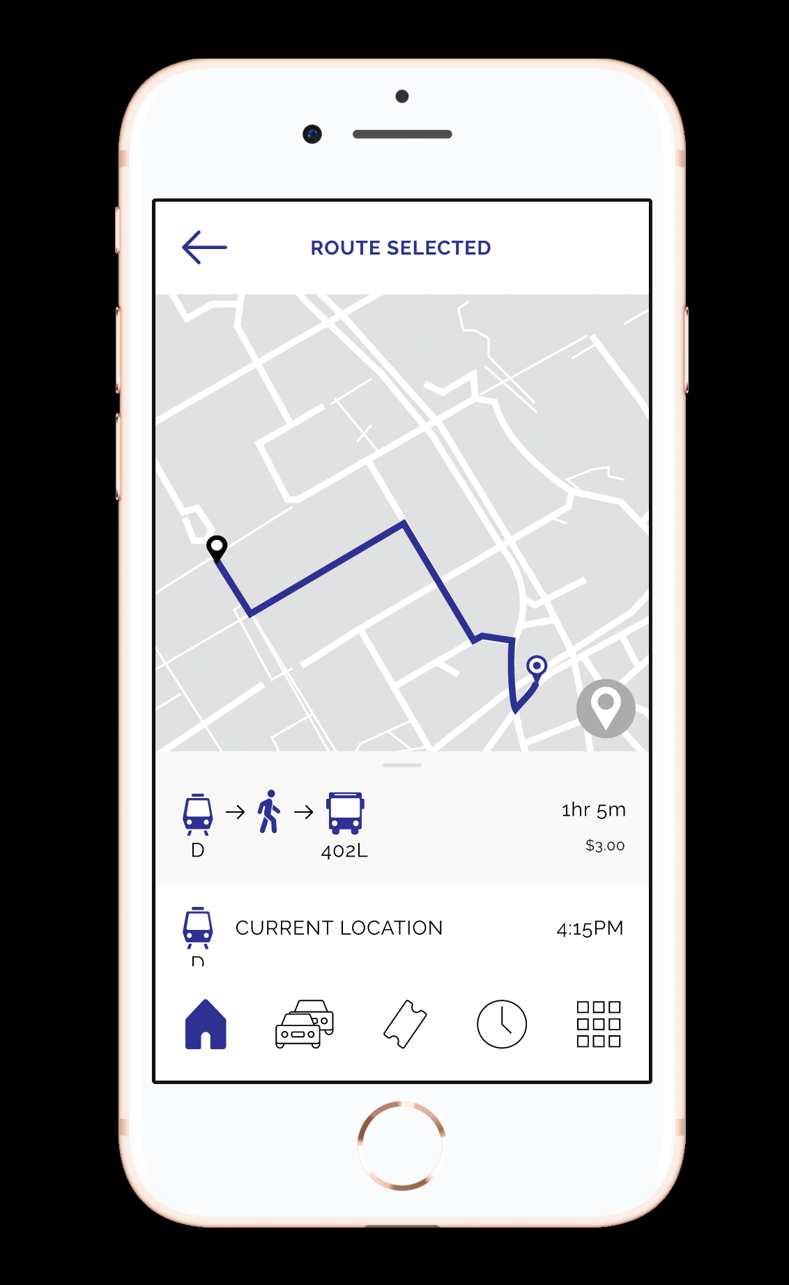
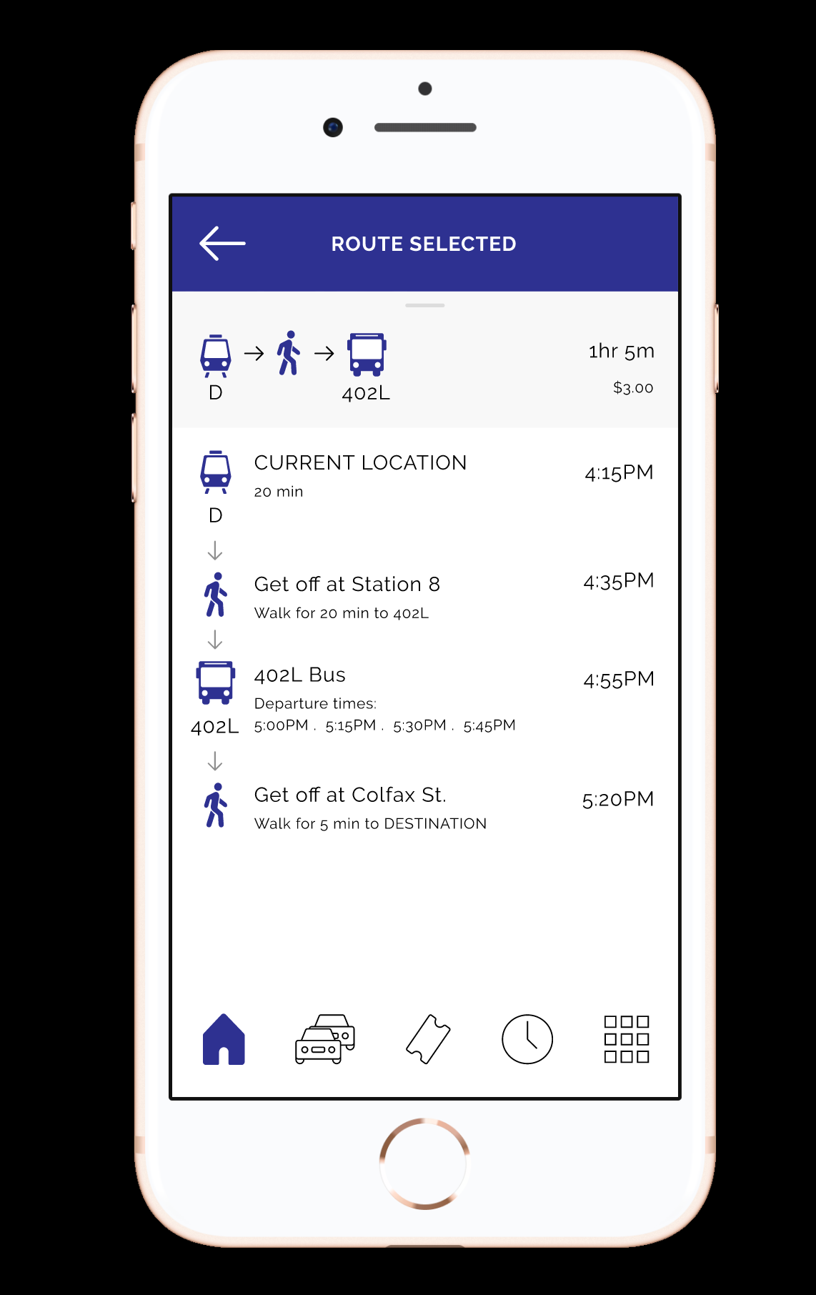
The redesigned experience centers around how riders actually move through transit, starting with trip planning.
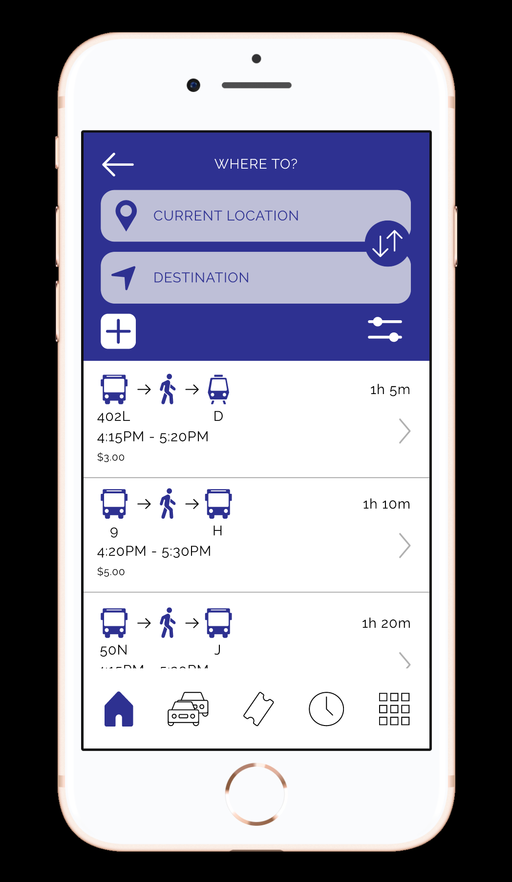
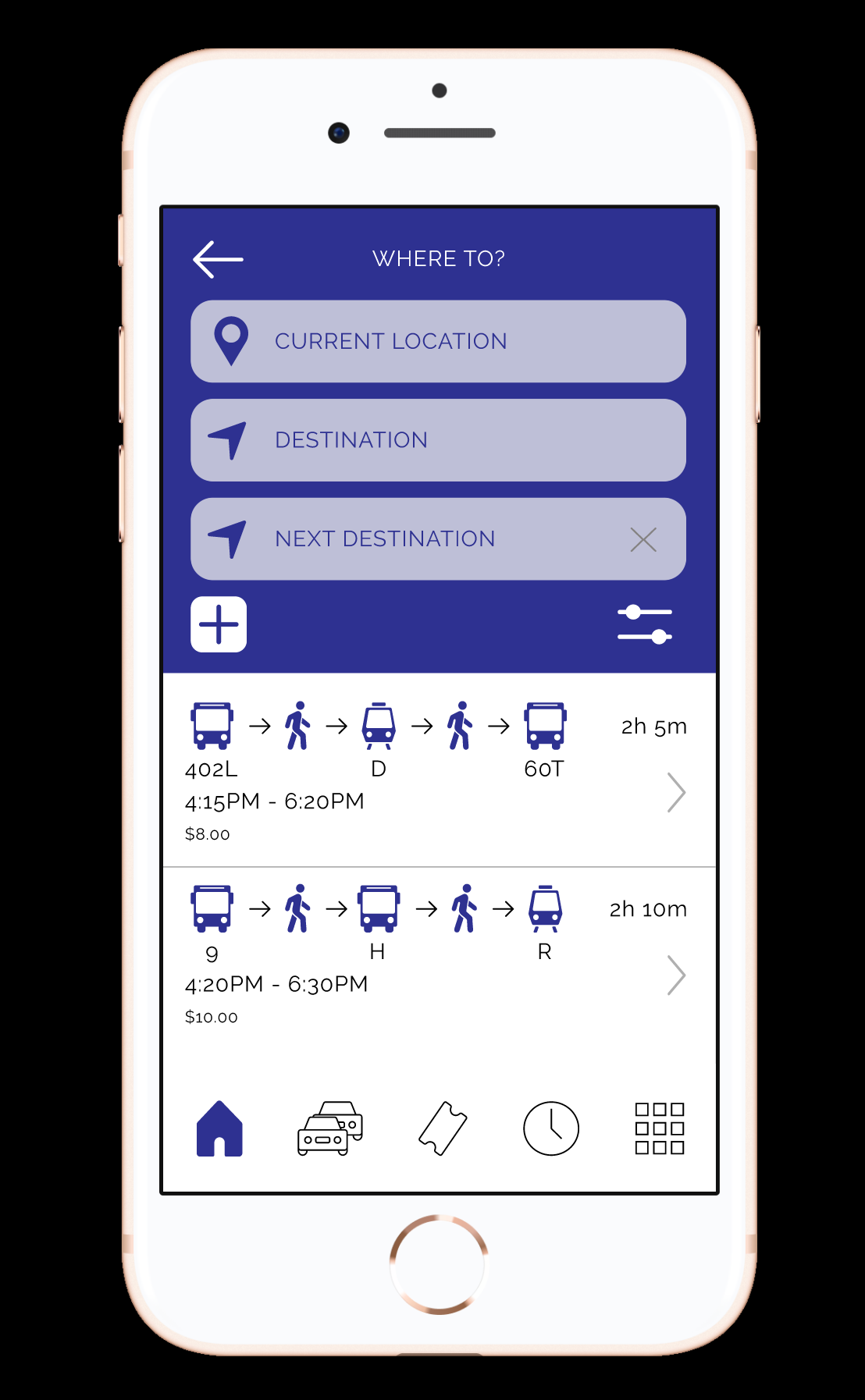
Routes are easy to scan, compare, and select, with clear hierarchy and minimal friction.
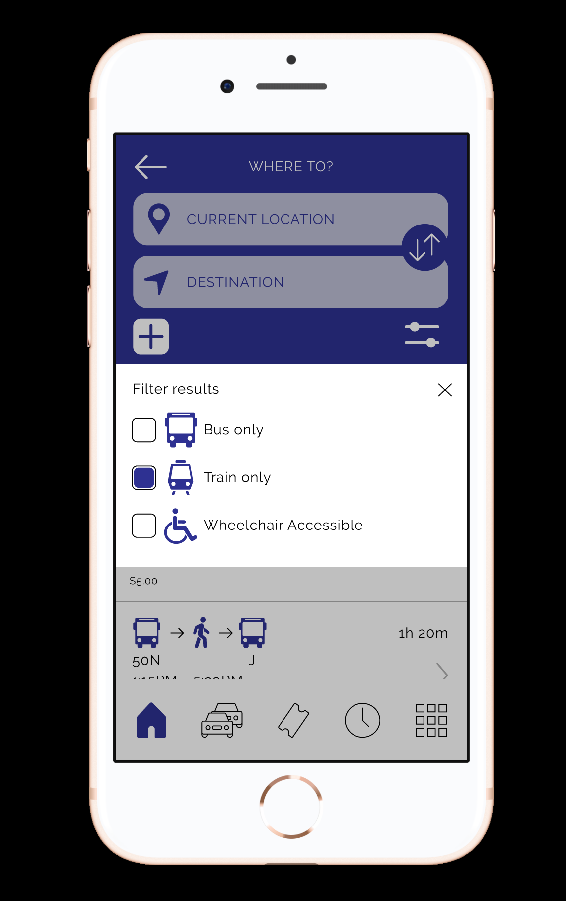
Filtering is integrated directly into the flow so users can quickly refine results without losing context.
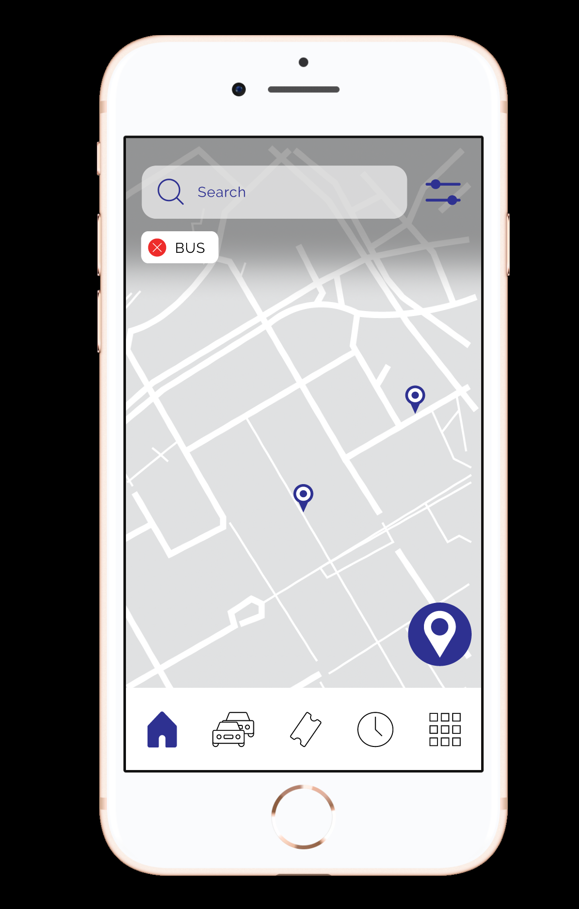
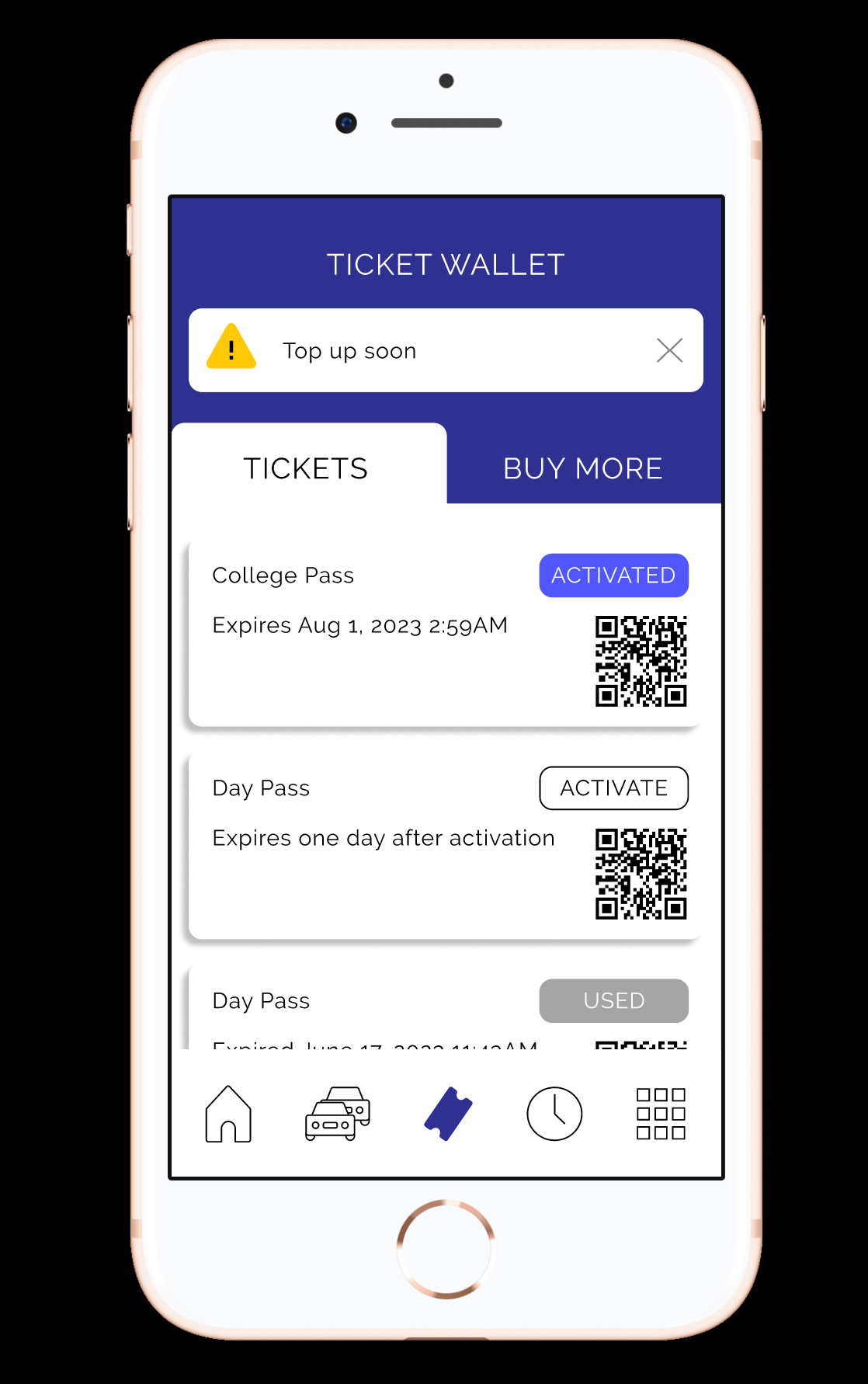
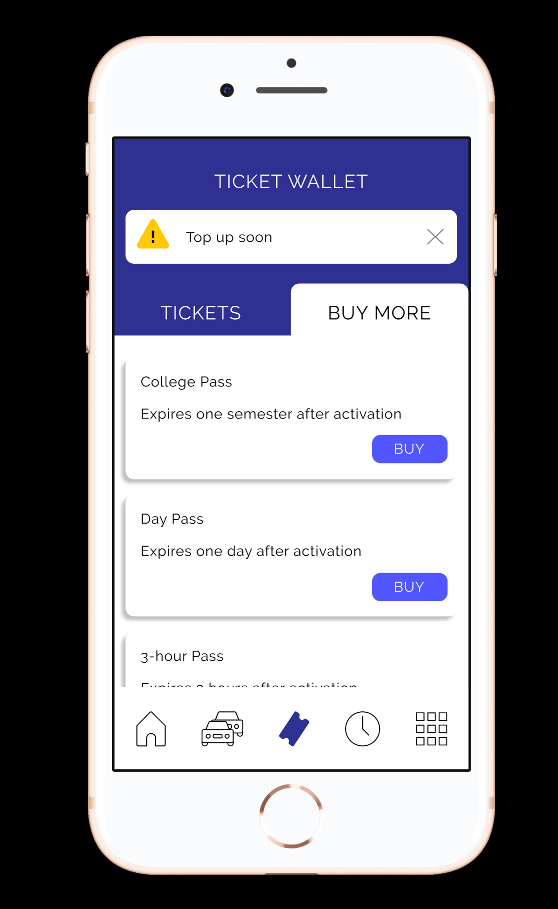
Ticketing is fully integrated into the experience rather than treated as a separate system.
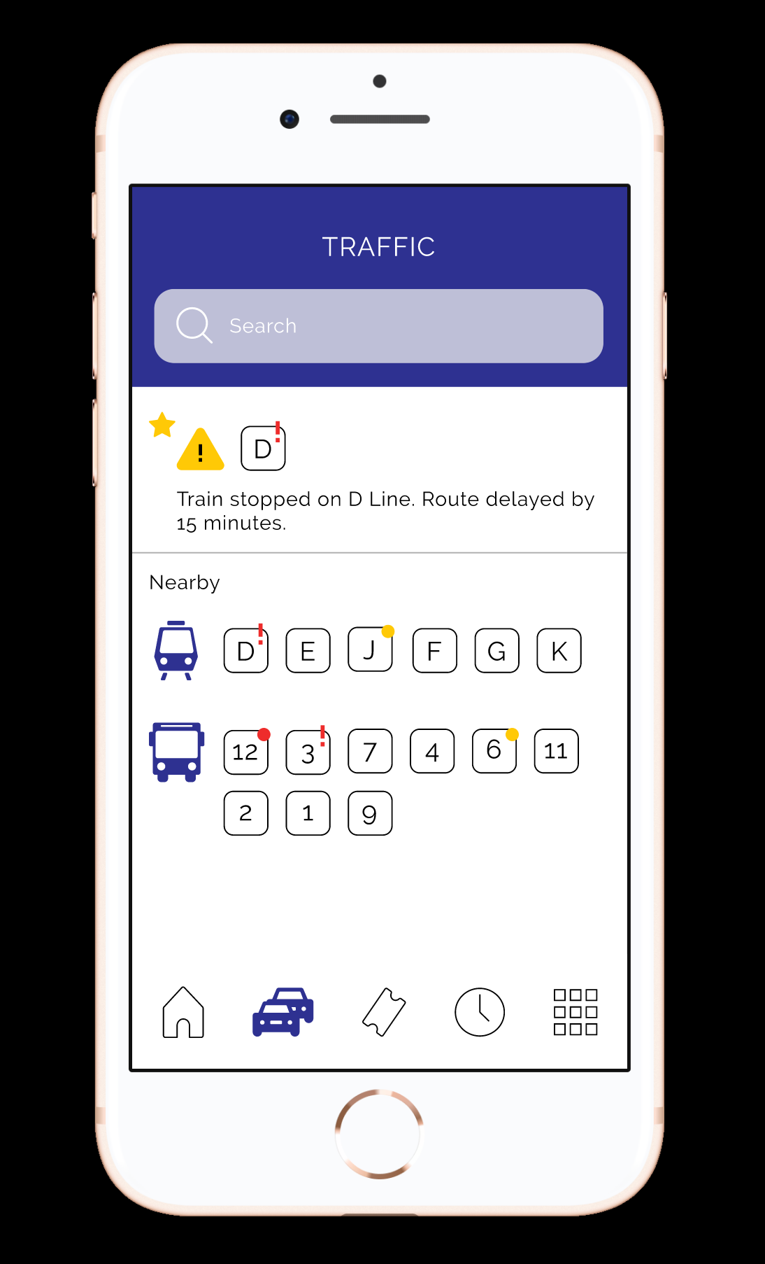
Service alerts are contextual, visible, and tied directly to the rider’s routes and nearby lines.
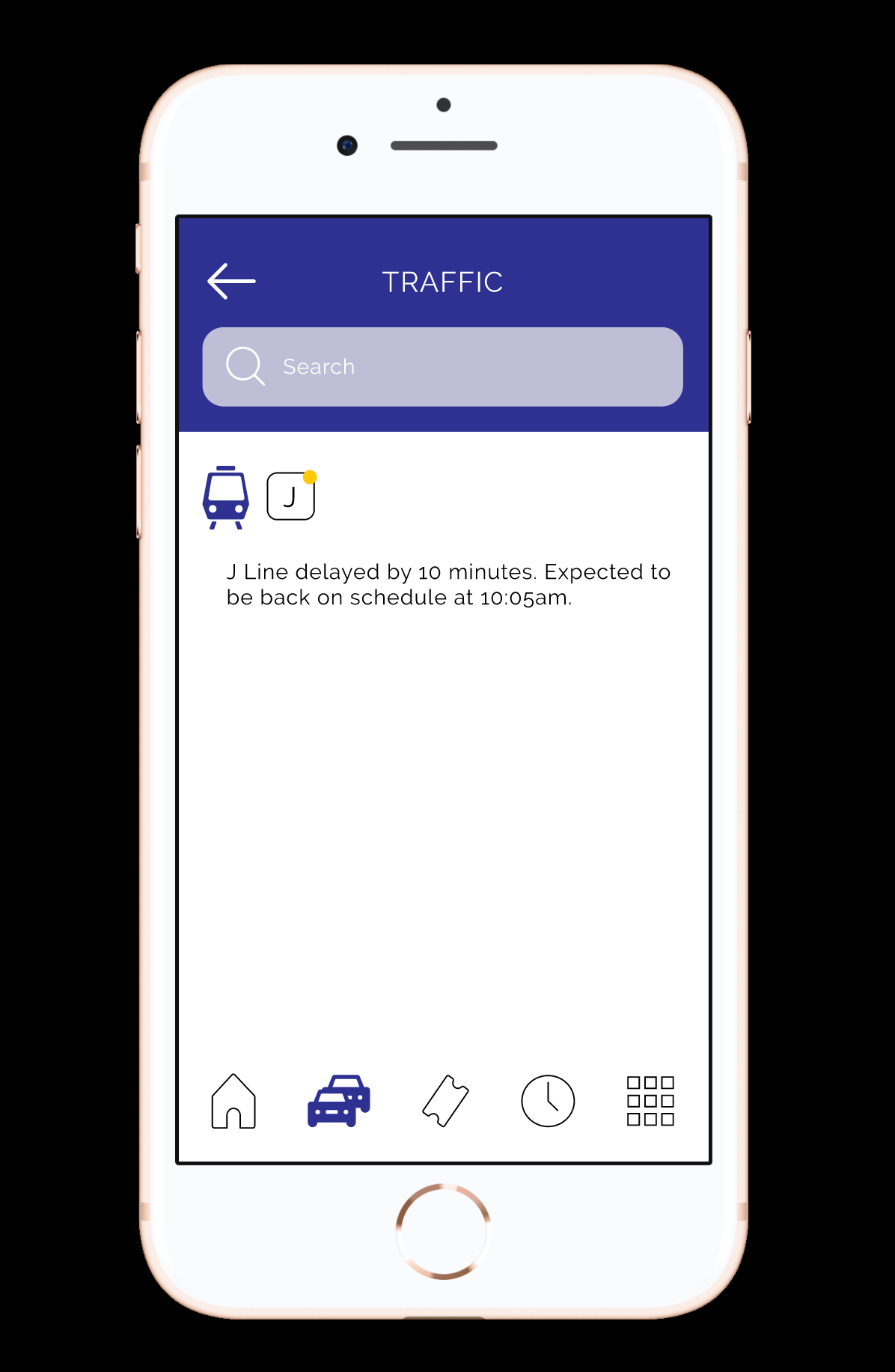
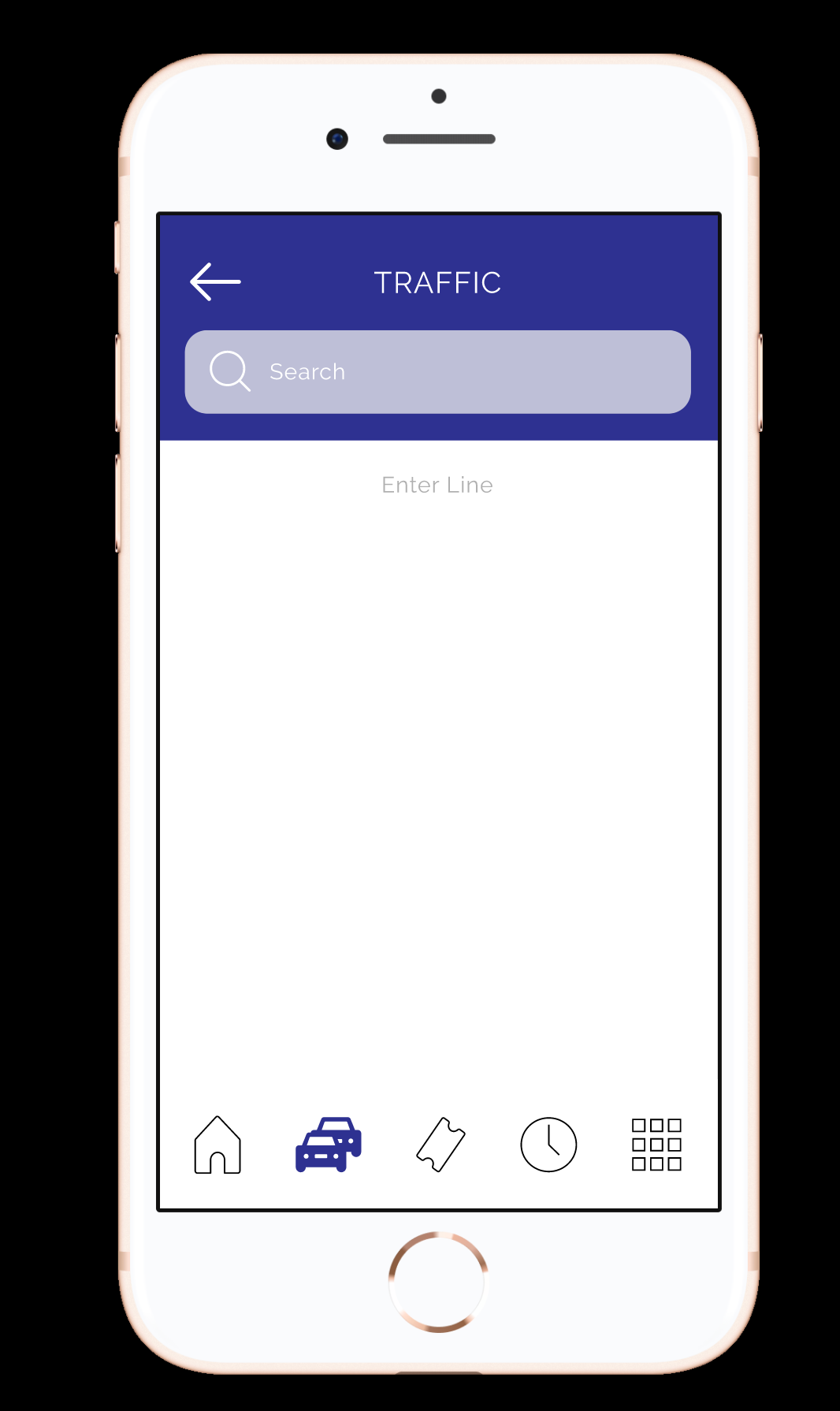
Across all features, consistent navigation and interaction patterns reduce cognitive load and make the system easier to learn and use over time.
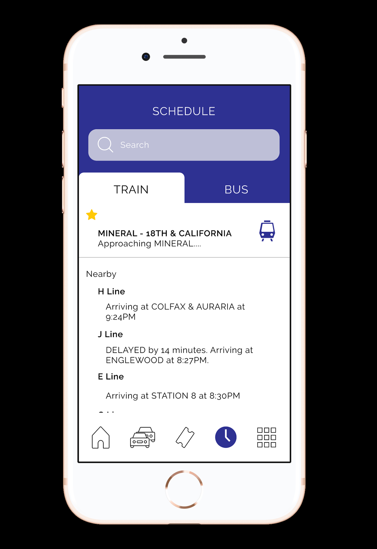
The result is a unified transit experience that reduces friction across the three most critical rider tasks: planning a trip, managing tickets, and responding to service changes. By consolidating previously separate systems into one cohesive interface, the concept improves speed, clarity, and usability in real-world, time-sensitive scenarios. This was a self-initiated project, driven by a clear usability gap and an opportunity to improve a system used daily by thousands of riders.
Take a look at my resume!