This project represents an earlier stage of my design practice and is included to show my approach to brand systems and identity thinking.
As a long-time Twinings customer, I was interested in how a heritage brand can evolve without losing the familiarity and trust it has built over time. This project explores how to modernize that experience while maintaining a sense of tradition.
The starting point for this project was a disconnect between modernization and familiarity. A recent packaging update to a favorite tea product felt like it lost some of the warmth and recognition that originally defined the brand.
The challenge became how to evolve a heritage identity without stripping away its character. This required thinking beyond a single logo and instead focusing on a system that could support consistency across packaging, print, and digital touchpoints.
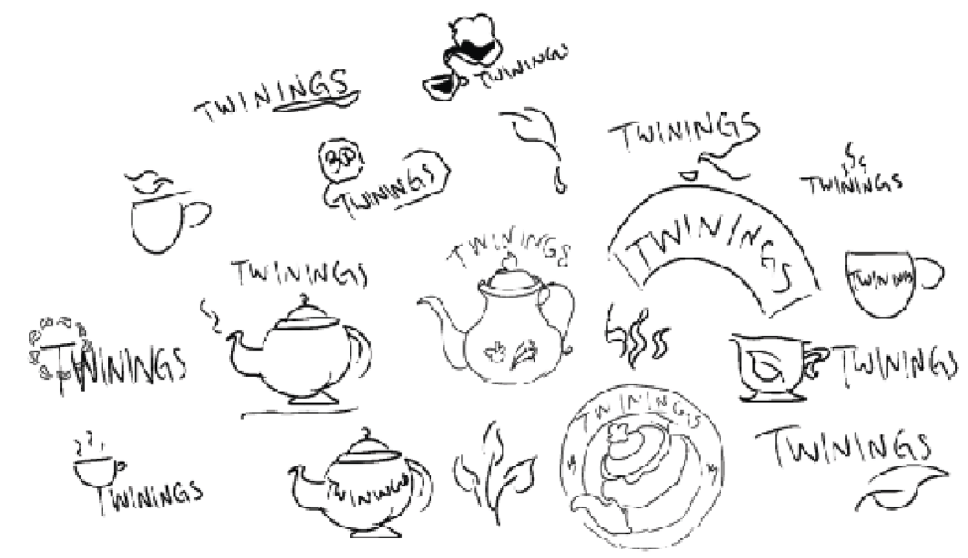
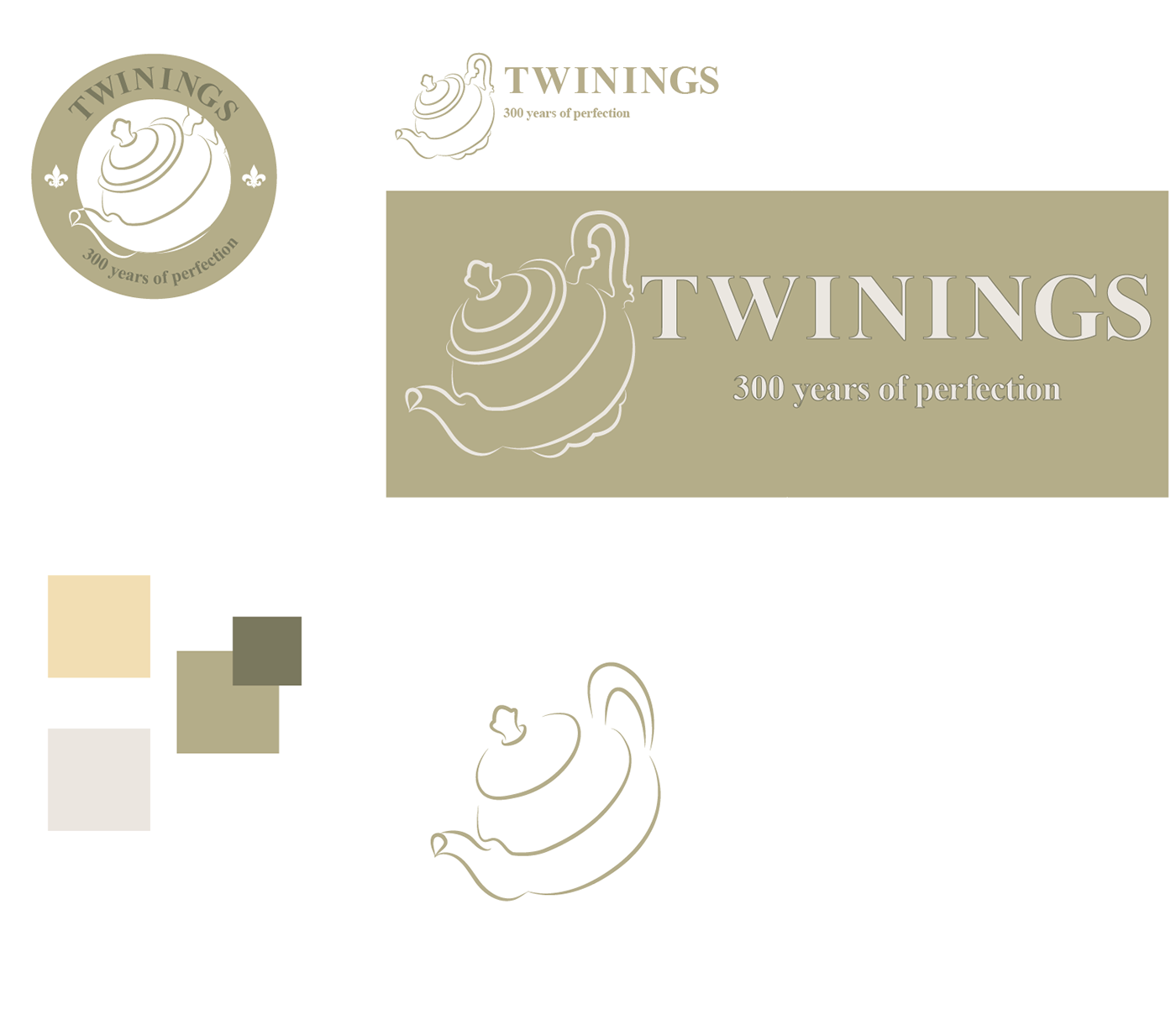
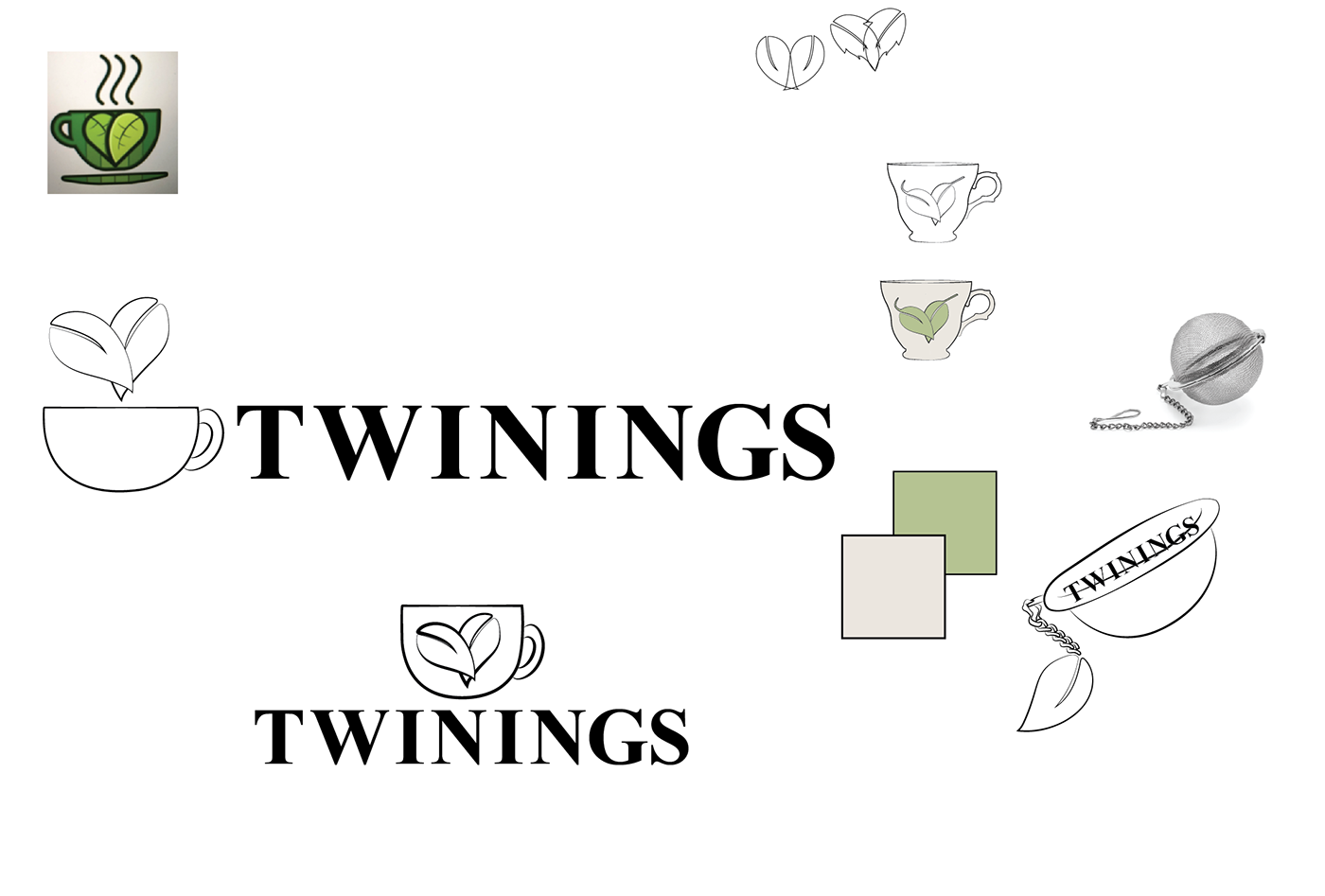
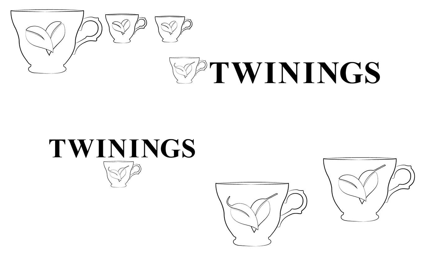
I began by exploring a range of logo directions, focusing on typography as the primary driver of identity. The goal was to retain a sense of tradition while simplifying forms to feel more contemporary and scalable.
These explorations tested how far the identity could be refined without losing its familiarity.
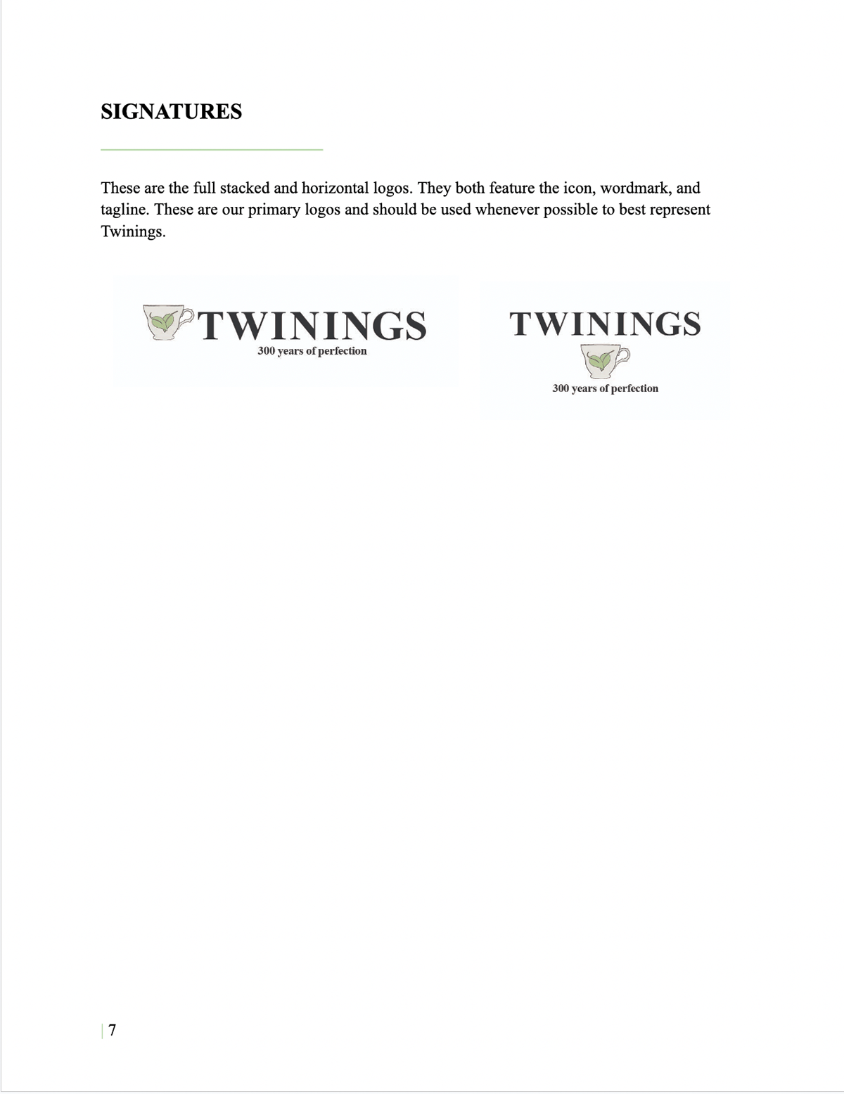
The final logo direction focuses on clarity, proportion, and restraint. By simplifying the structure and refining the typography, the identity feels more modern while still grounded in a heritage aesthetic.
This direction became the foundation for the broader brand system.
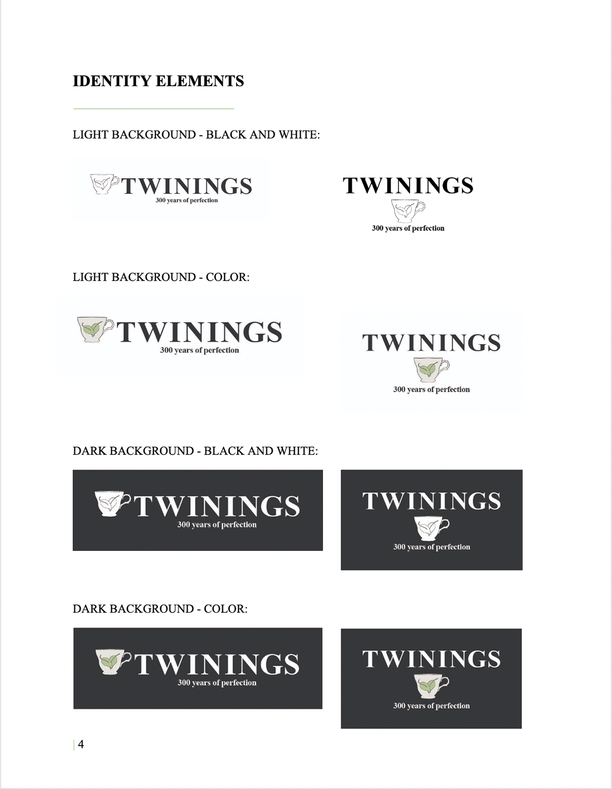
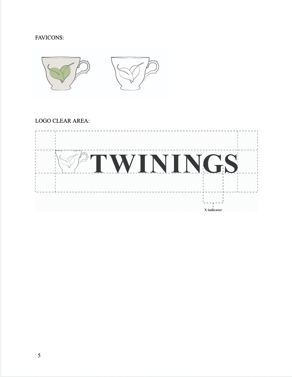
Rather than treating the logo as a single asset, I developed a system that defines how it behaves across contexts. This includes spacing rules, clear area, and variations to ensure consistency regardless of placement.
This step shifts the work from visual design into system design.
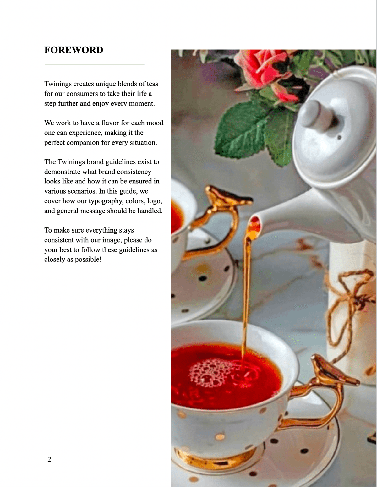
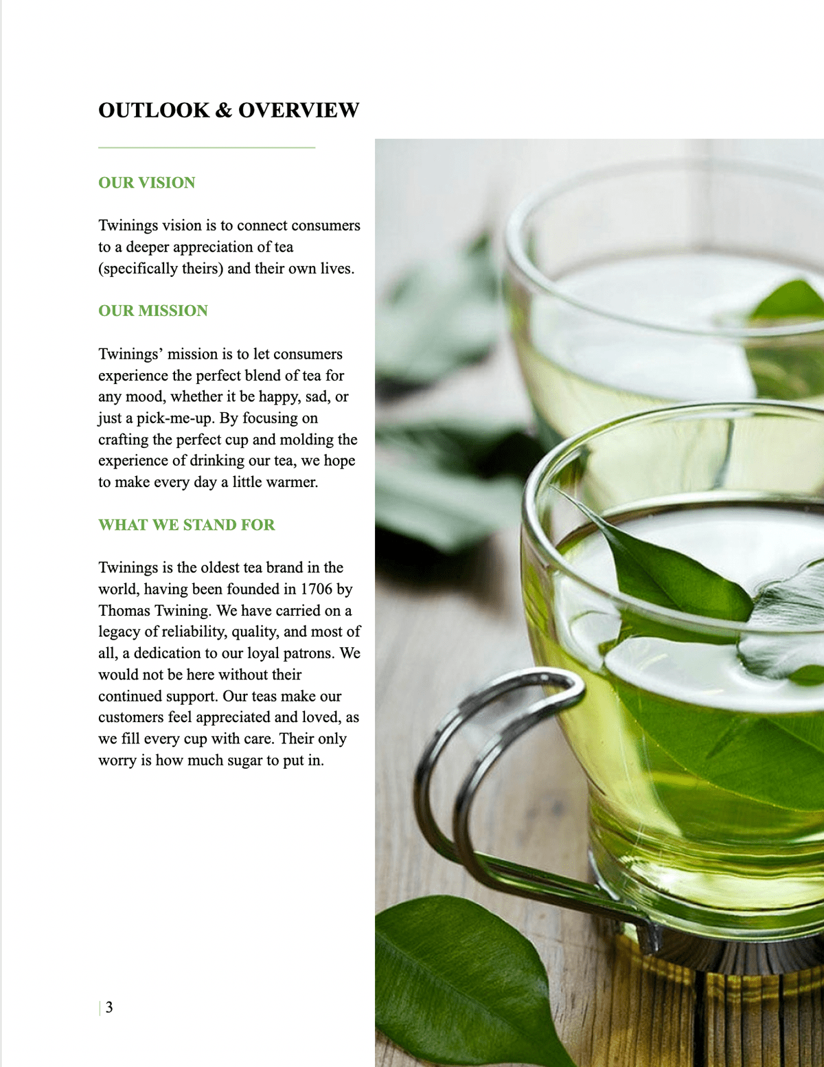
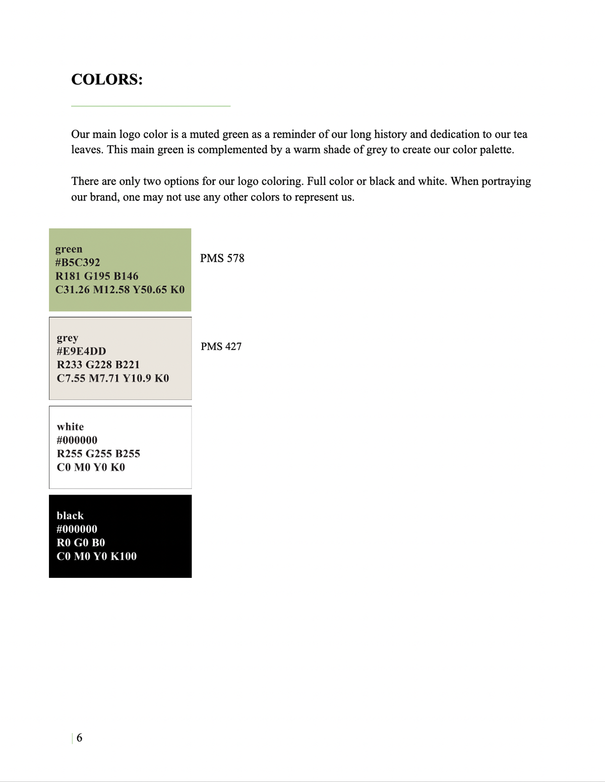
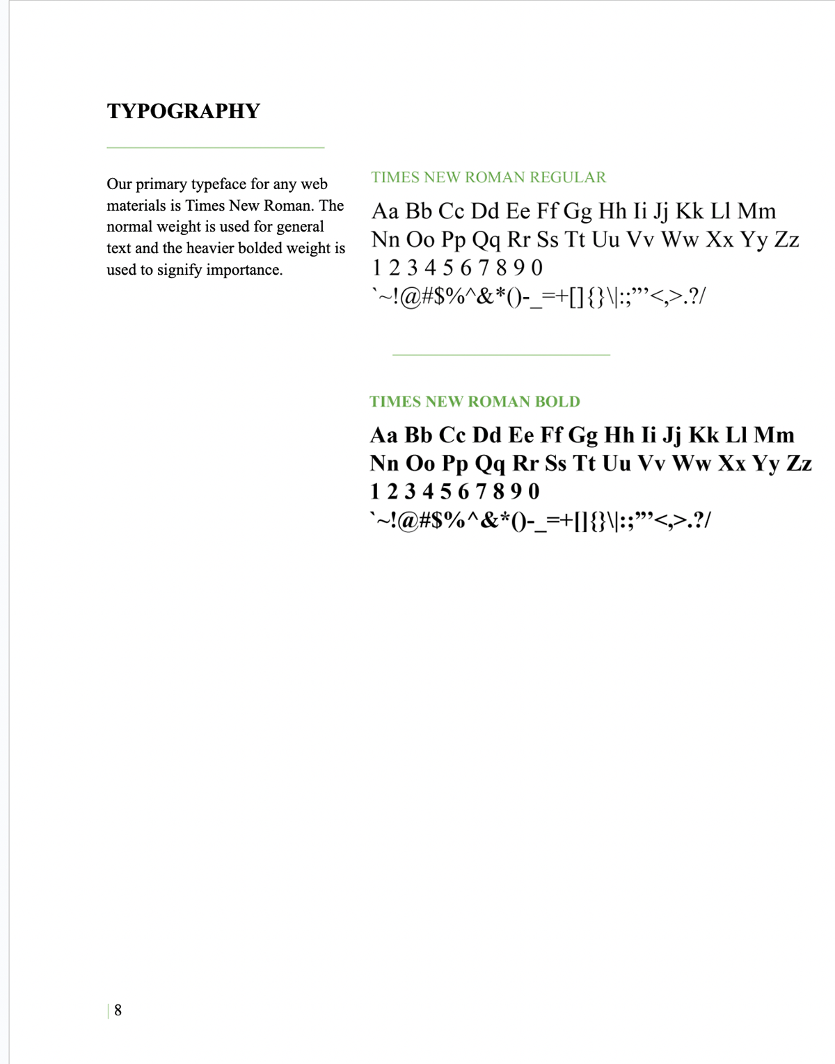
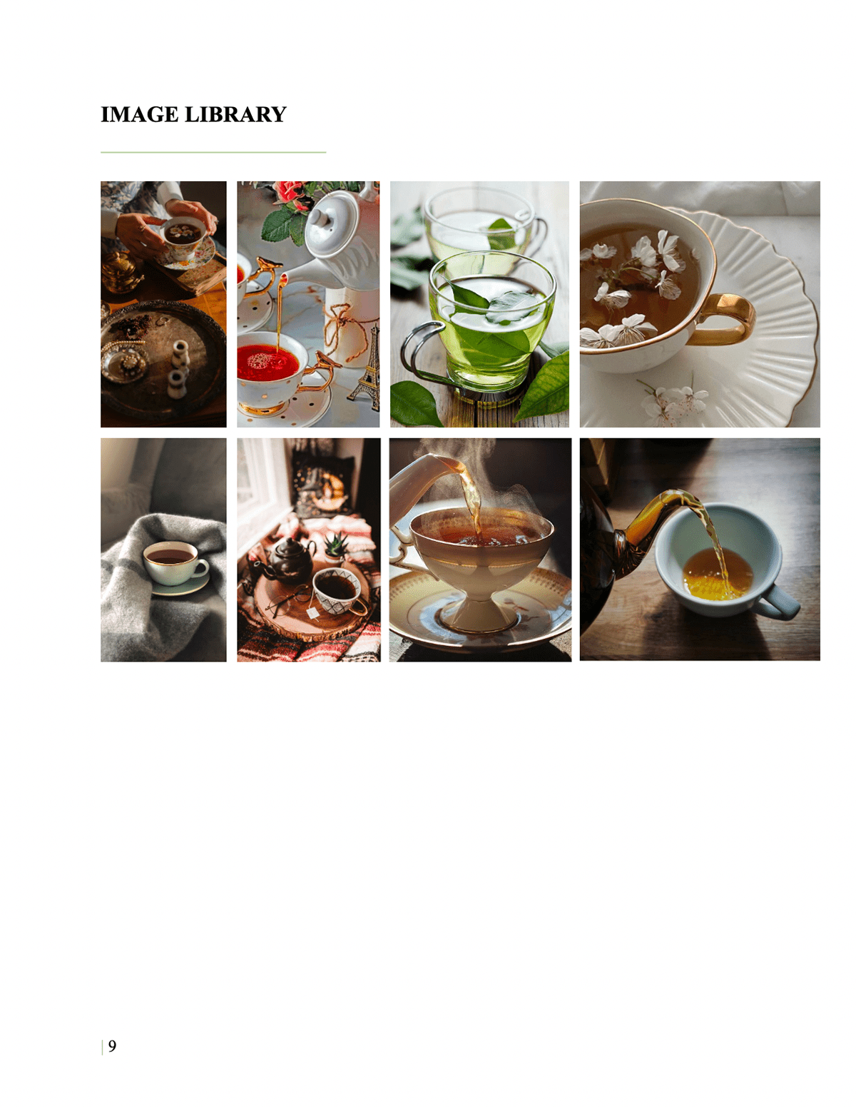
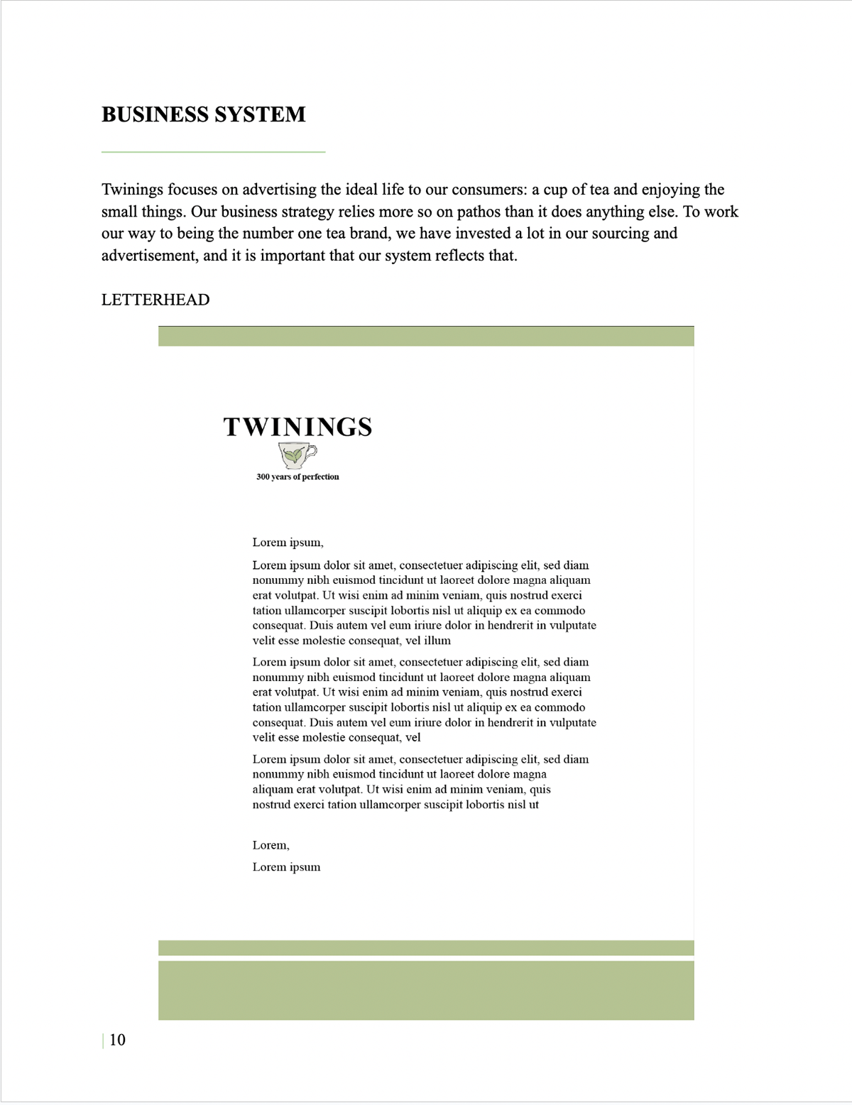
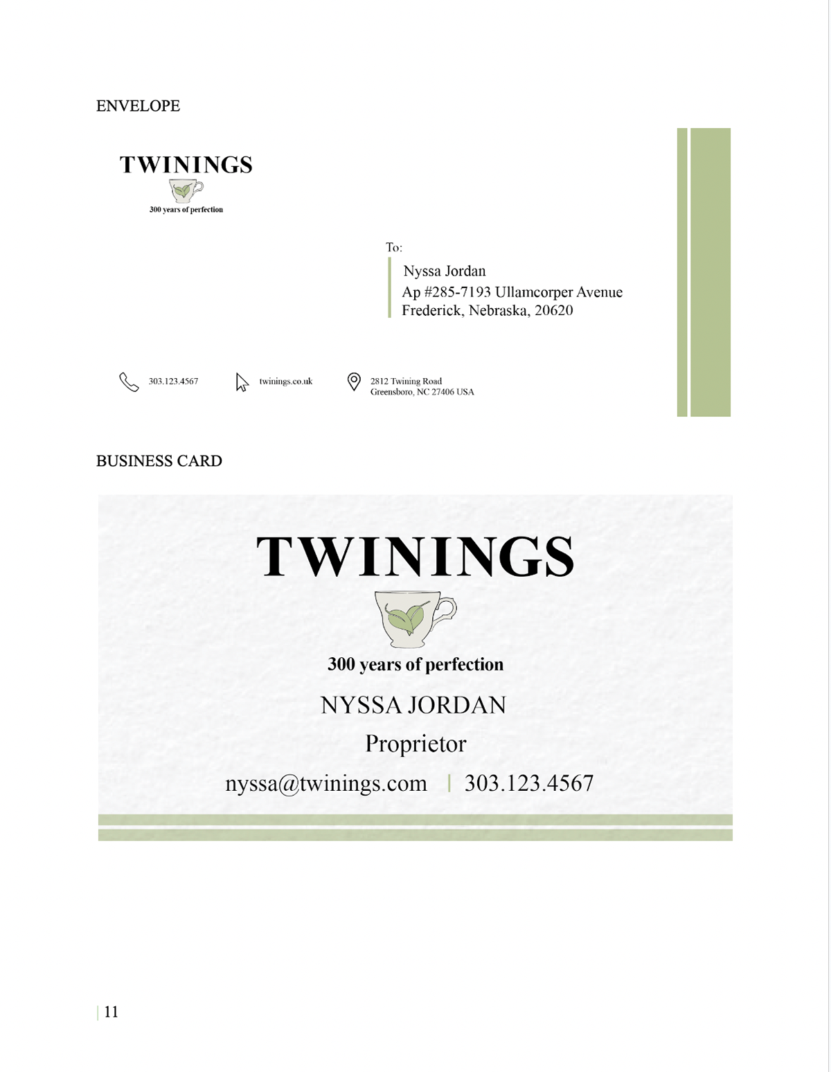
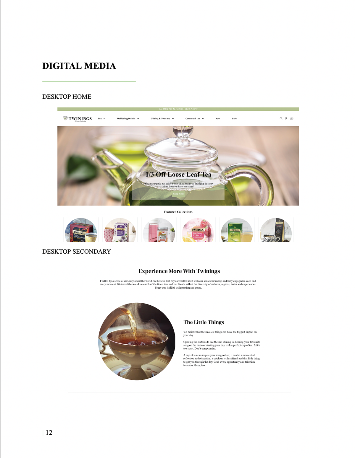
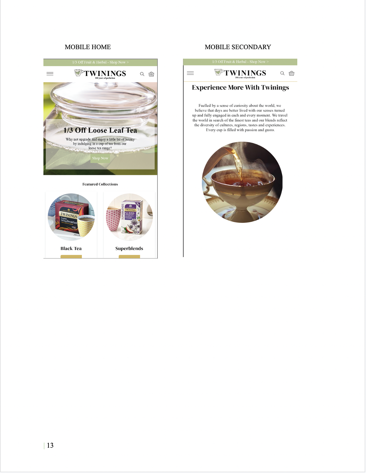
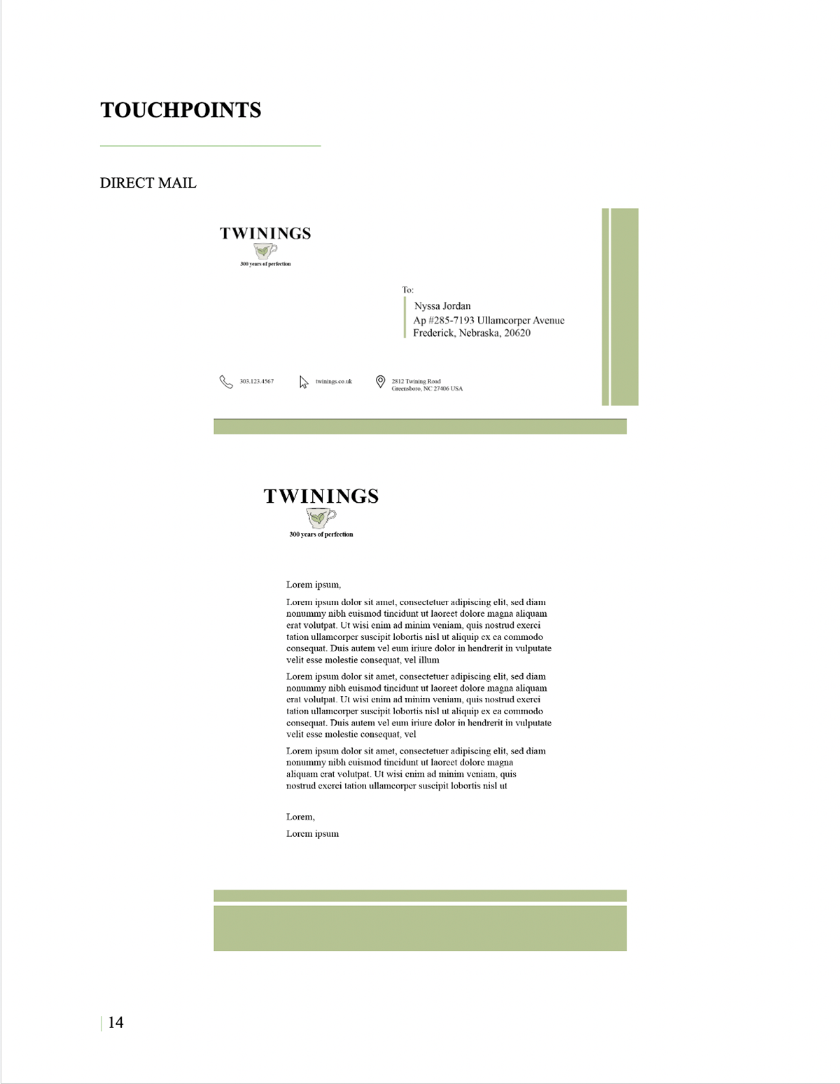
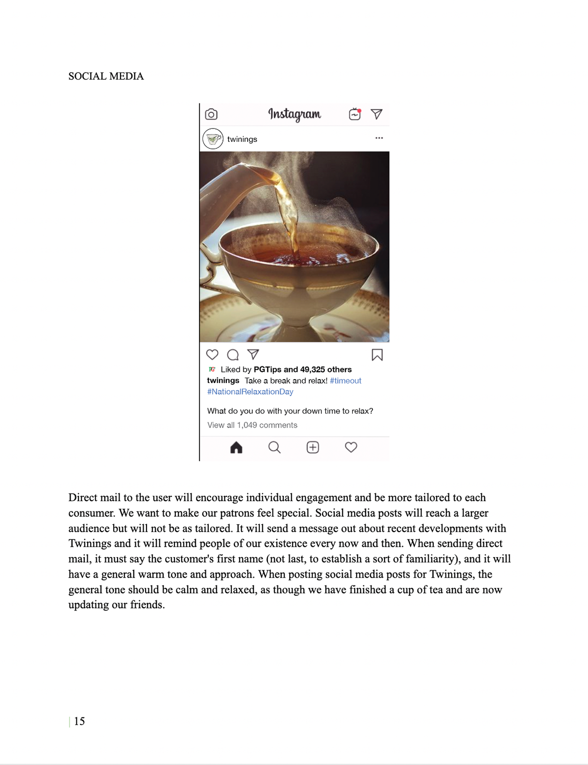
The project culminates in a full brand guidelines document, outlining how the identity is applied across all touchpoints.
This includes:
The focus was on building a system that could scale and remain consistent over time, rather than designing isolated assets.
IMPACT
This project demonstrates an early focus on systems thinking in branding. While the visual execution reflects an earlier stage of my work, the underlying approach emphasizes structure, consistency, and long-term scalability.
It highlights the ability to move beyond individual design elements and define a cohesive identity that can function across multiple contexts.
Take a look at my resume!